Milan moments; Our highlights from the world’s most influential design week
Each year the eyes of the design world firmly fix on Milans prestigious Salone del Mobile, the busiest design week on the interiors calendar. This year, we headed over to Milans creative districts ourselves, in search of the latest inspiration from the exhibition itself as well pop-ups, installations and more.
Milan's Salone del Mobile is an unmissable event.
It’s the busiest design week within the interiors calendar, on an international level, showcasing and celebrating creativity, innovation and quality in equal measure. Noting just six top highlights from the world’s most influential design week was, quite frankly, difficult but you will see one common characteristic found throughout this years showcase; the revival of an objects narrative value.
1.
Wallpaper Handmade - a world of wellness
Wallpaper magazine’s iconic installation dedicated itself this year to curating a sanctuary for the self with ‘Wellness and Wonder’; a specially commissioned collection of designs by skilled makers from across the globe.
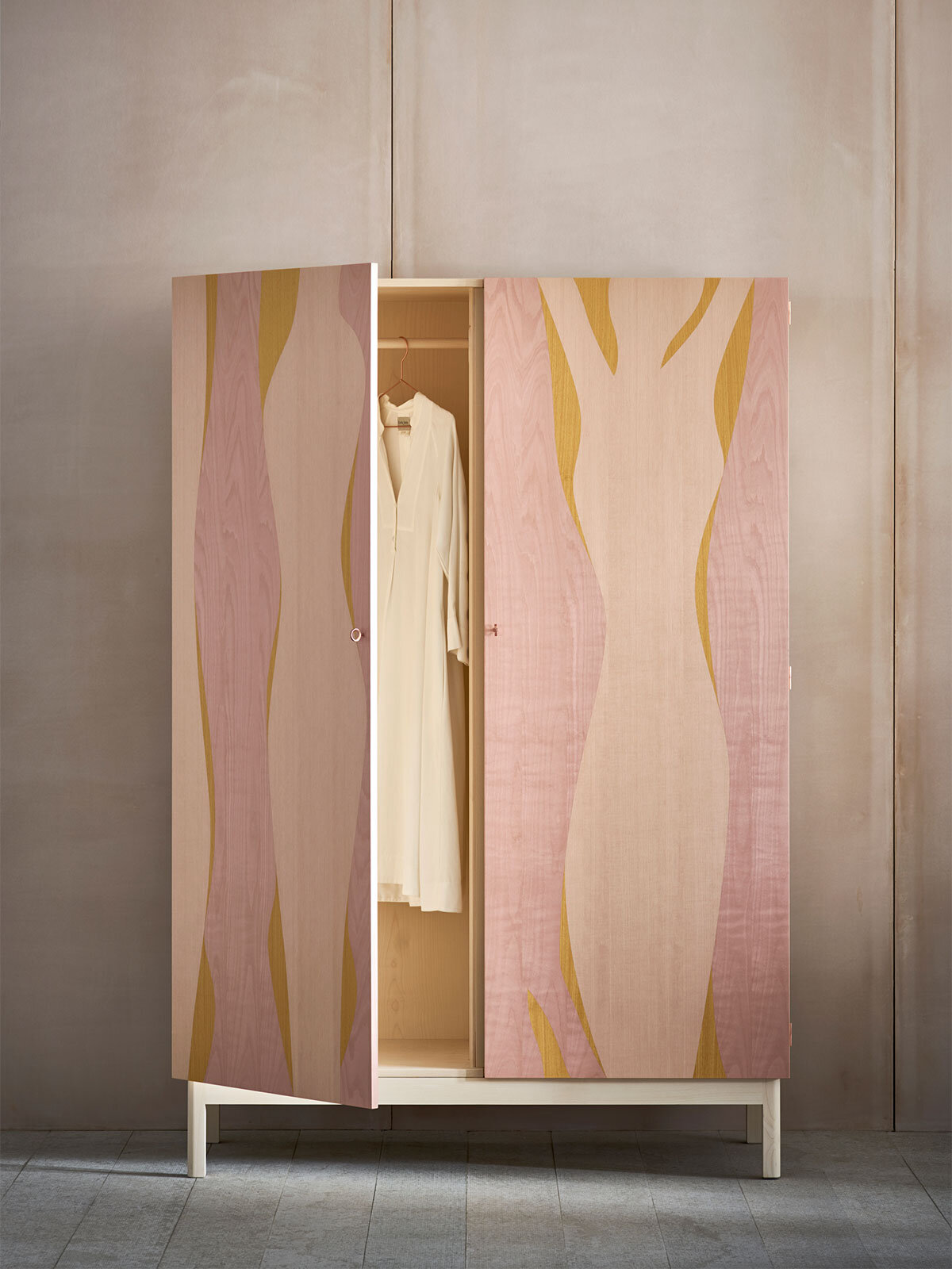
British design studio Pinch London were a particular highlight, a brand created to enhance our daily lives with a core focus on warmth, substance and most importantly the human experience. Aiming to encourage and enable users to live well through carefully crafted design, Pinch showcased the new ‘Elan Armoire’ cupboard which utilised dynamic marquetry techniques to create a truly considered design inside and out. The British brand are also able to colour match to all Paint & Paper Library colour references for those in favour a monochromatic interior scheme...
2.
Nature invading
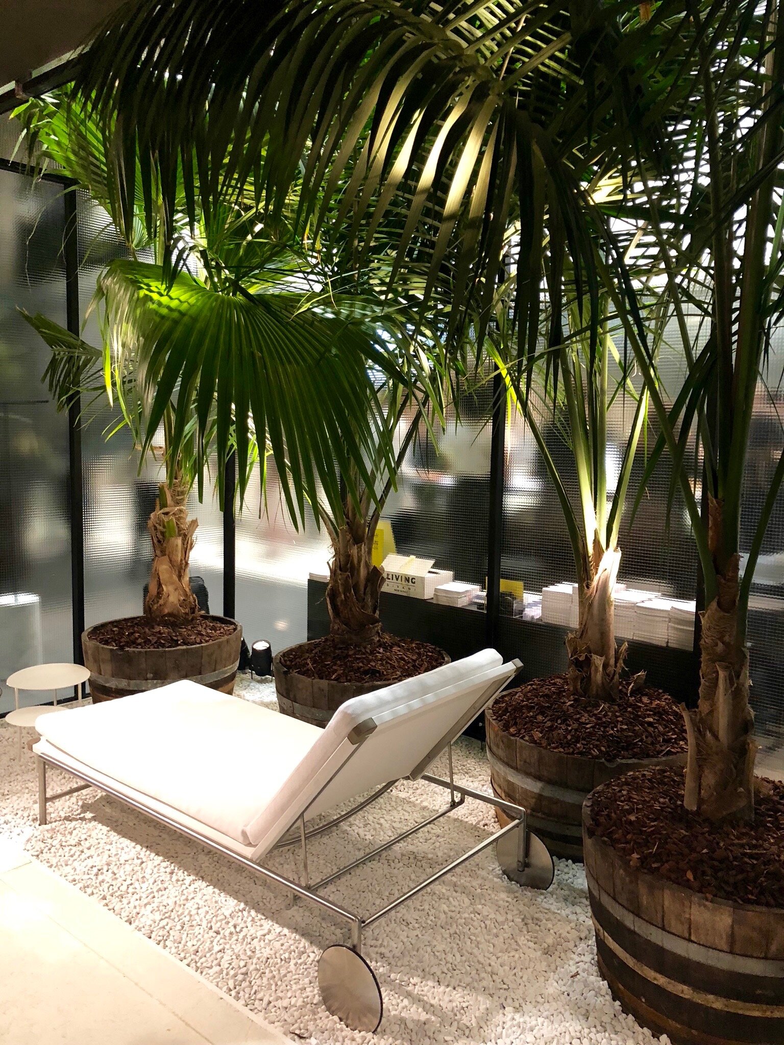
Interior botanicals have grown and multiplied - an organic progression for the plant trend that’s become a mainstay in most homes. The use of large-scale tropical plants, grouped and clustered, could be seen almost everywhere with a clear focus towards architectural styles, something previously highlighted during our visit to Tom Dixon’s, The Coal House.
The continued relevance of nature is based on our experience with greenery itself, which is instinctive, garnering dramatic effects on our emotional wellbeing and reducing stress; whether that be at work or in a home environment. We’ve already made a conscious effort to grow our own indoor-jungle at the studio, utilising nature to curate an impactful visual with holistic benefits.
3.
Cos X Phillip K Smith III - Open Sky
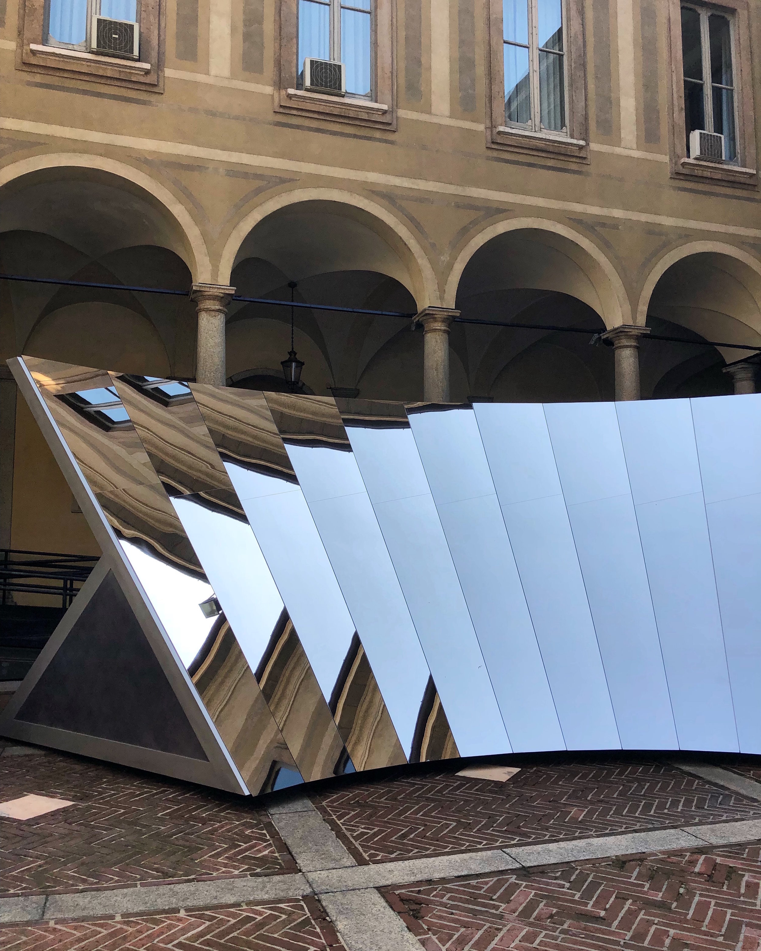
The sensory reactions of light, space and colour formed the basis of this years Cos collaboration with artist Phillip K Smith III. The immersive installation mirrored the structures Italian-renaissance surroundings at the Palazzo Isimbardi but also a 360 degree view of the sky; a meditative tribute to the world around us viewed with an ever changing perspective.
As a brand Cos consistently focus on the sensorial elements of tactility, modernity and functionality and these core values were clearly presented within Open Sky, curating a considered and unique experience.
4.
Minimalist lighting
The word ‘minimalism’ denotes a visual mood board of clean lines, monochromatic palettes and brutalist architecture however the true meaning is not an aesthetic…
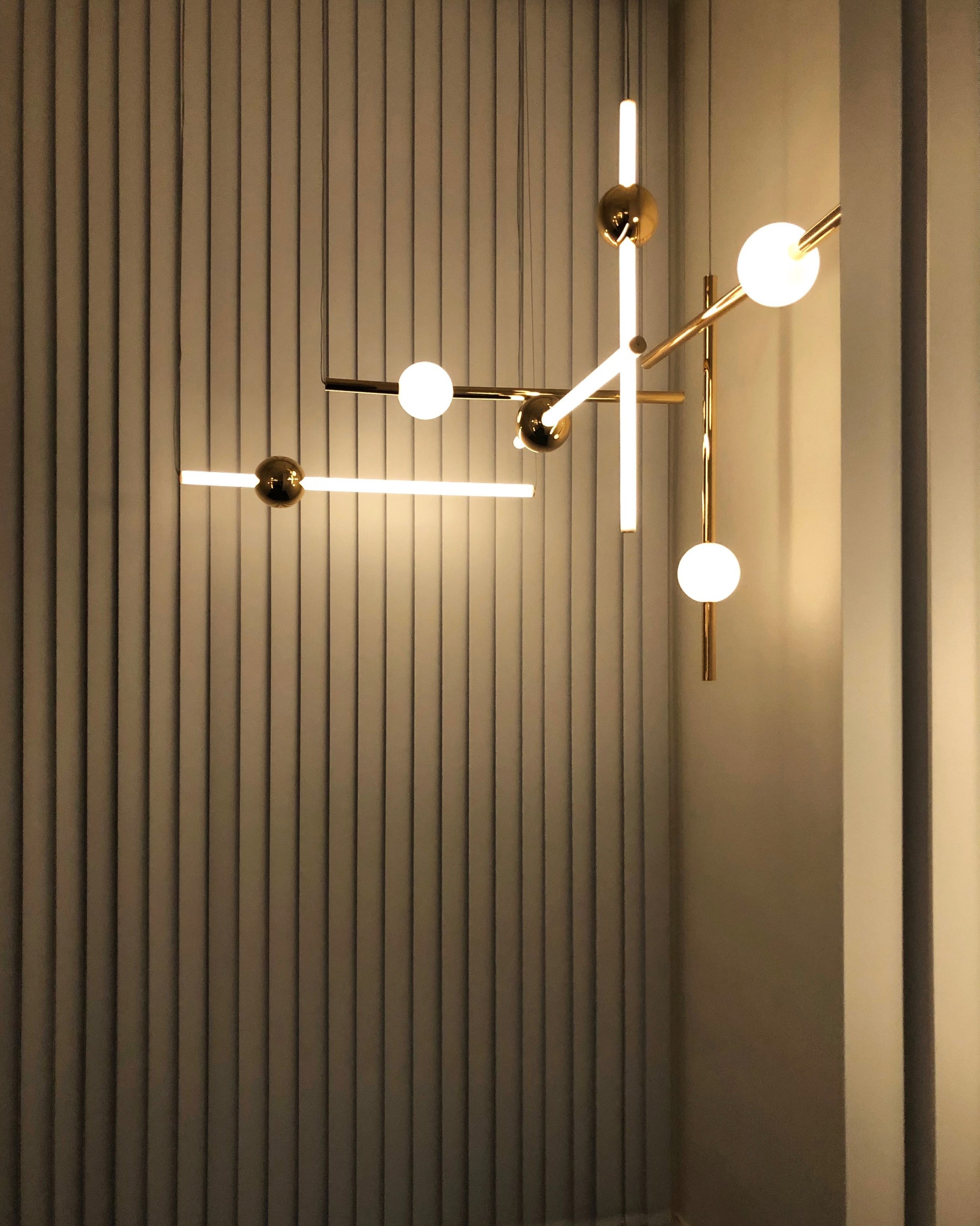
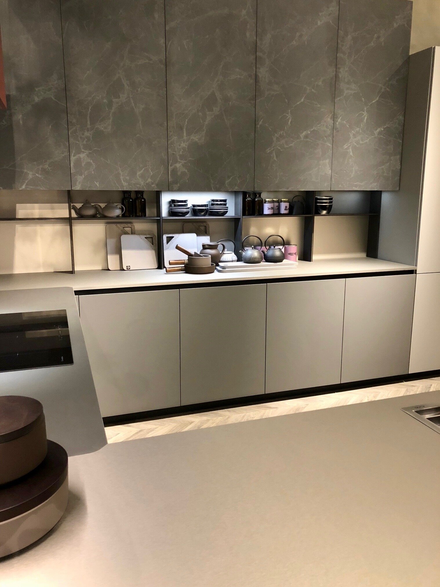
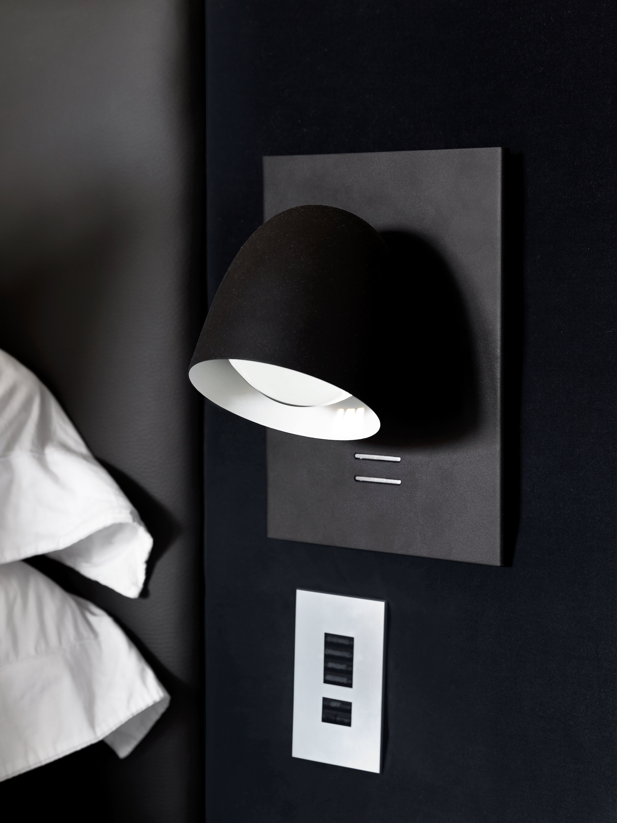
Do our possessions offer purpose? That’s the question on every minimalists lips, a key sentiment apparent throughout a variety of the brands presentations this year with lighting in particular utilised as a tool rather than as a statement. Hidden LED lights behind mirrors or within cabinetry were cleverly combined with directional lighting, designed with function at its very core. Where pendant-lighting statements were made the forms were large but notably simple, even within British designer Lee Broom's latest product launch - titled 'Observatory'. Presented within an equally pared-back installation, each design played with sculptural and spherical forms, with mirror-polished finishes in modular systems, allowing the lighting sculptures to be built according to a spaces needs.
5.
Vitra - Typecasting
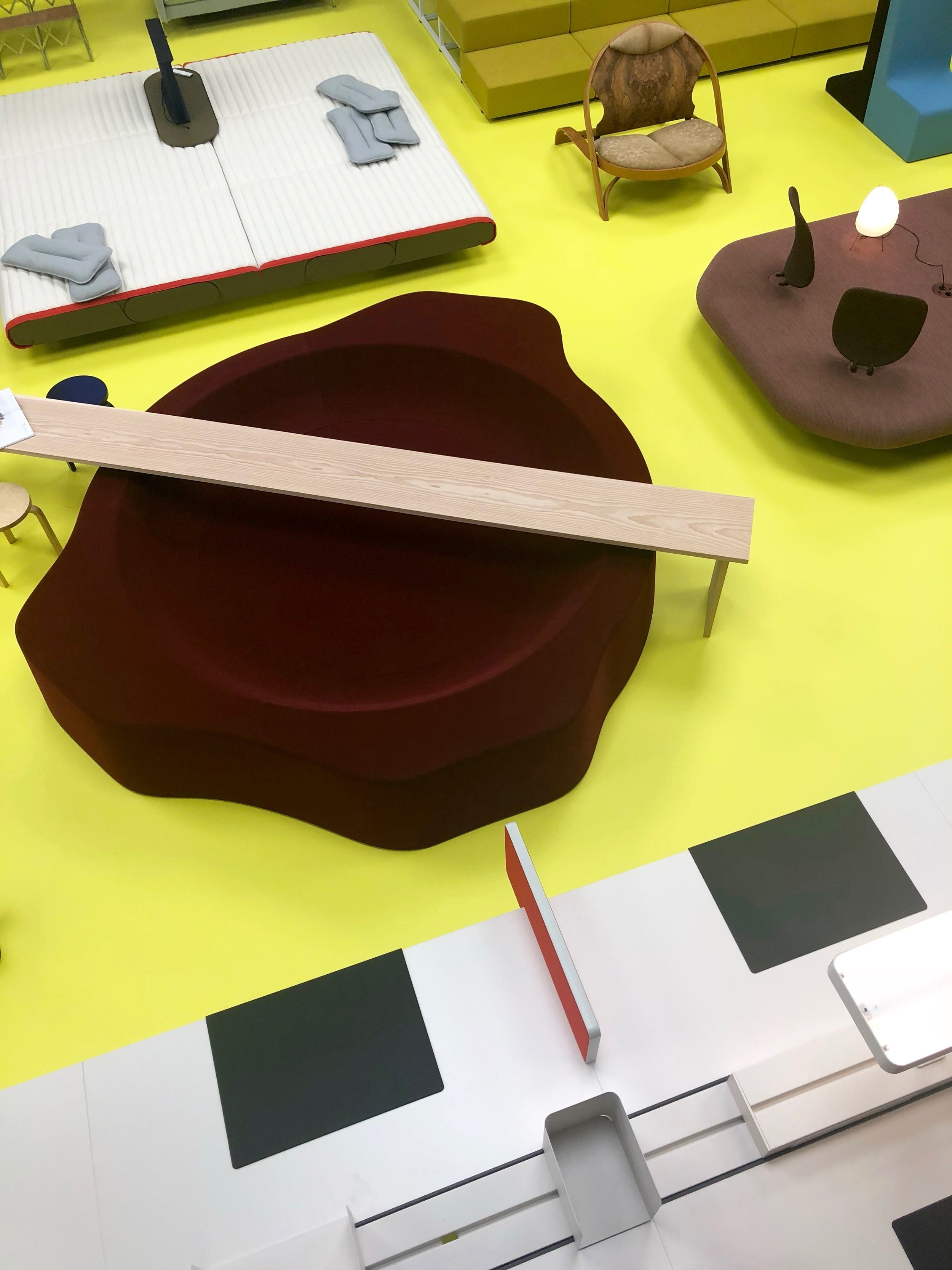
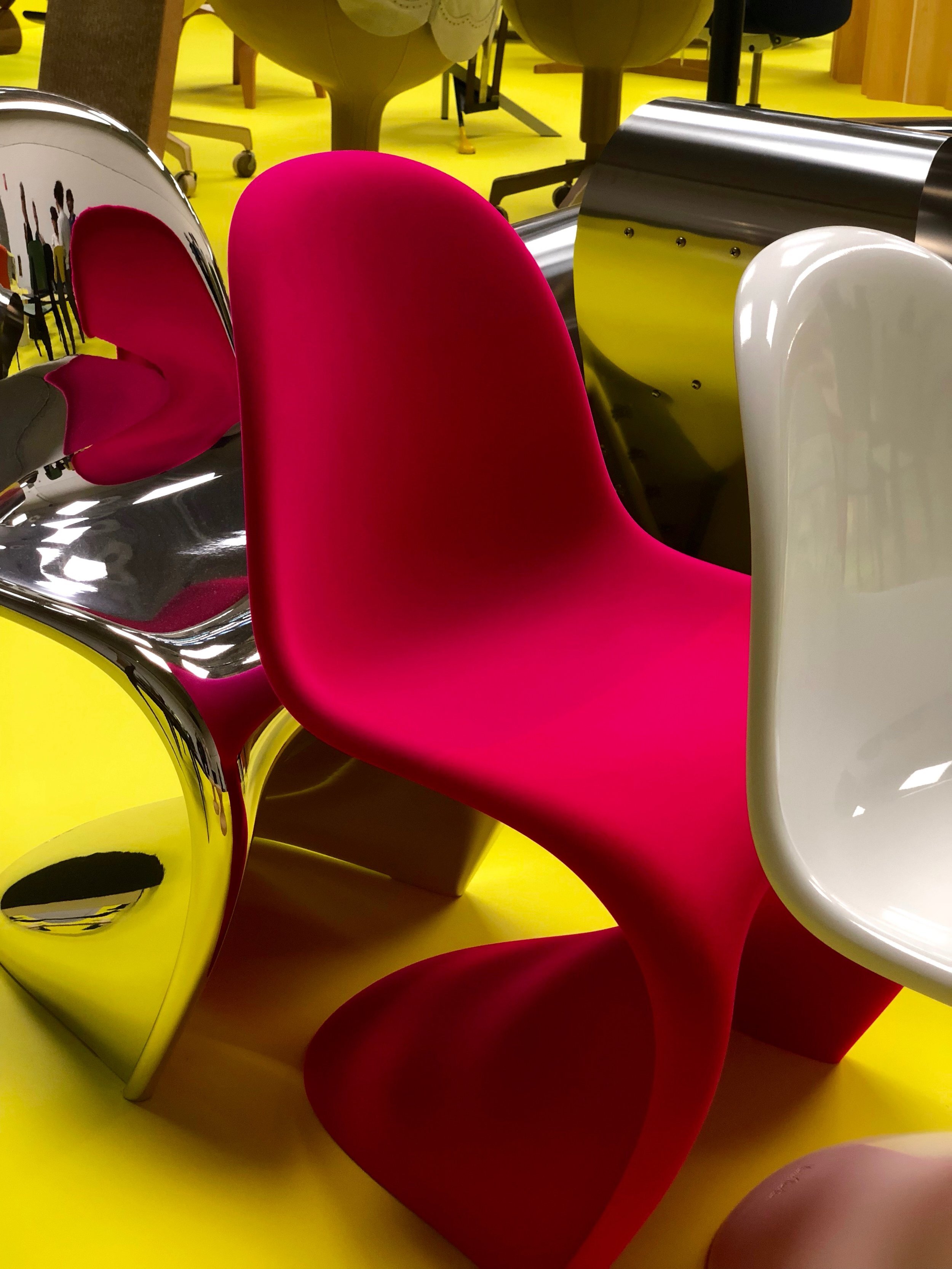
The iconic Vitra, a brand well known for its collaborative design ethos with design greats such as Charles & Ray Eames, George Nelson, Jean Prouve and Ronan & Erwan Bouroullec hosted Typecasting; an assembly of iconic, forgotten and new Vitra classics.
The opening party, held the evening prior to Milan’s Salone Del Mobile official opening, provided an exclusive and expansive view of Vitra's past, present and future. The curator of the exhibition, designer Robert Stadler, emphasised the social role furniture plays in our daily lives, of chairs in particular, exploring why identifying oneself with particular objects is essential for cultivating and projecting an individual self-image. The collection was split into various ‘profiles’, defined by the product’s characteristics and function. The 'Communals' profile was particularly interesting, a collections of objects designed to invite people to gather, share and communicate.
6.
Textual togetherness
Change is underway in global premium-living. In a constantly evolving world our homes social capabilities have become increasingly significant. The current mood of ‘Togetherness’ was consciously considered within the textured elements showcased this year, from modular sofas to silky high-pile rugs; comfort and customisation were consistently key.
Possibly the most refreshing considerations however were made within upholstery. Dining and lounge chairs were presented without the formalities normally associated to them, embracing suedes, finishes loose and gathered, for a more inviting and comforting experience.
The German brand, Rolf Benz, like us believe that a home is not a place, it’s a feeling - which is possibly why they’re contemporary, biomorphic concepts felt so inspiring to us.
The Coal Office; a holistic experience
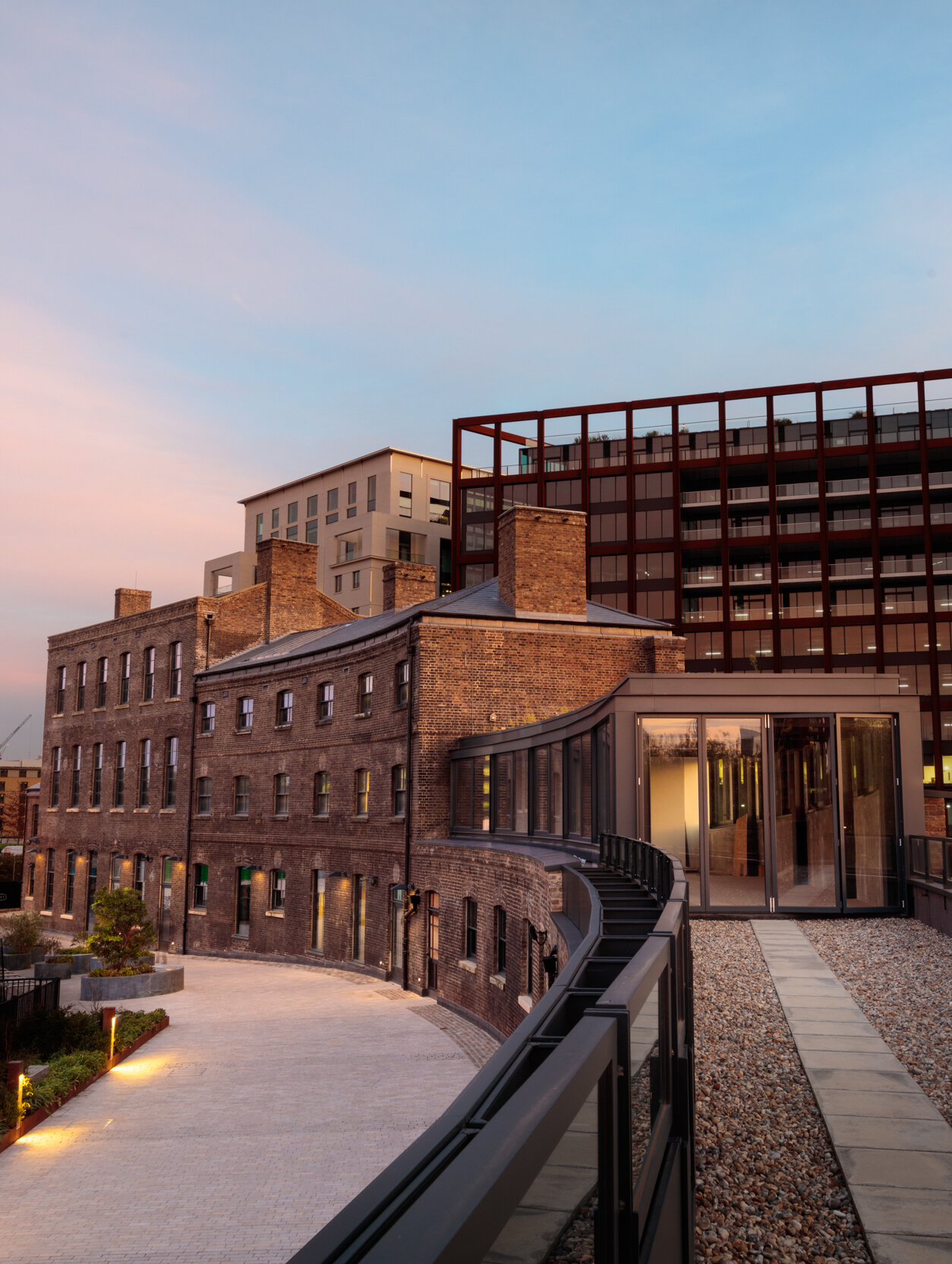
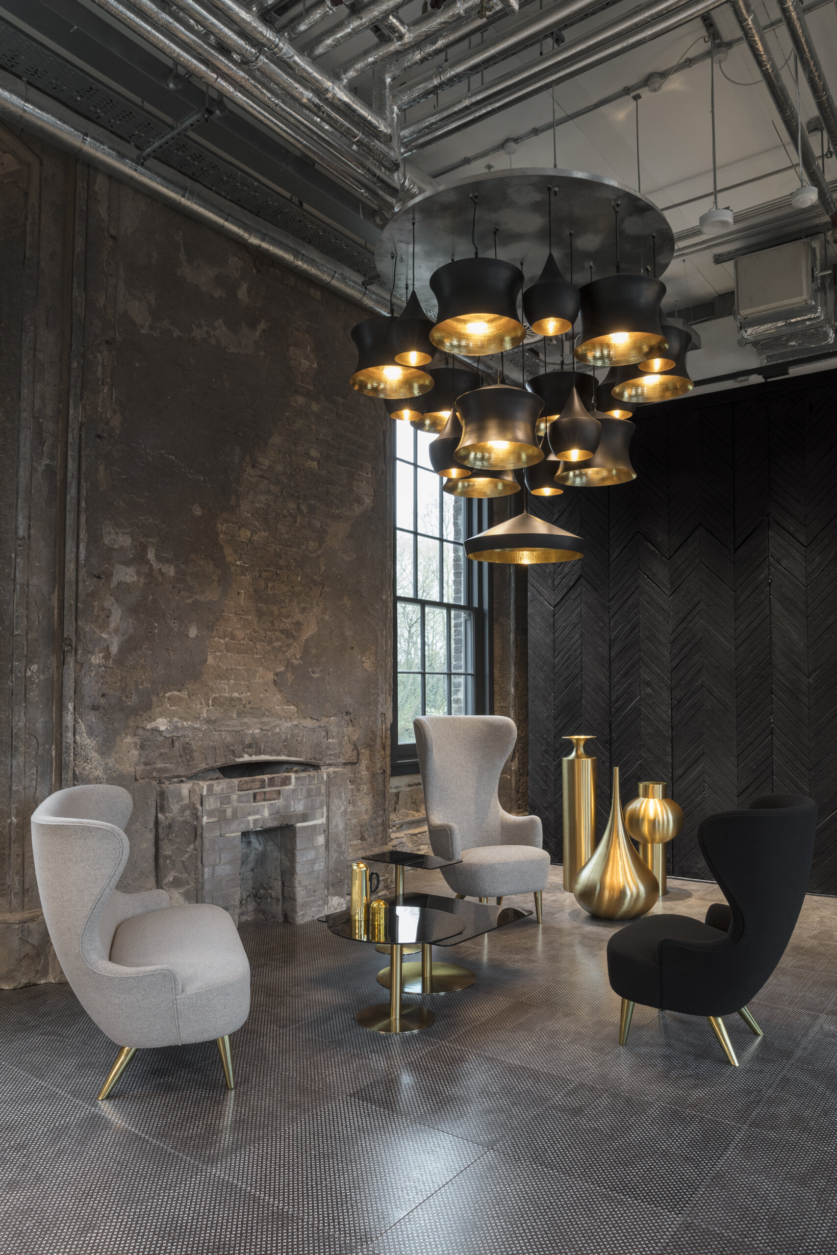
Against an industrial backdrop, Tom’s Dixons new HQ, The Coal Office, leads the way as a multi-disciplinary space for innovation in design.
A fresh London home for Tom Dixon’s latest experiments, innovations and collaborations.
The Coal office is designed to push the boundaries of contemporary retail as we know it.
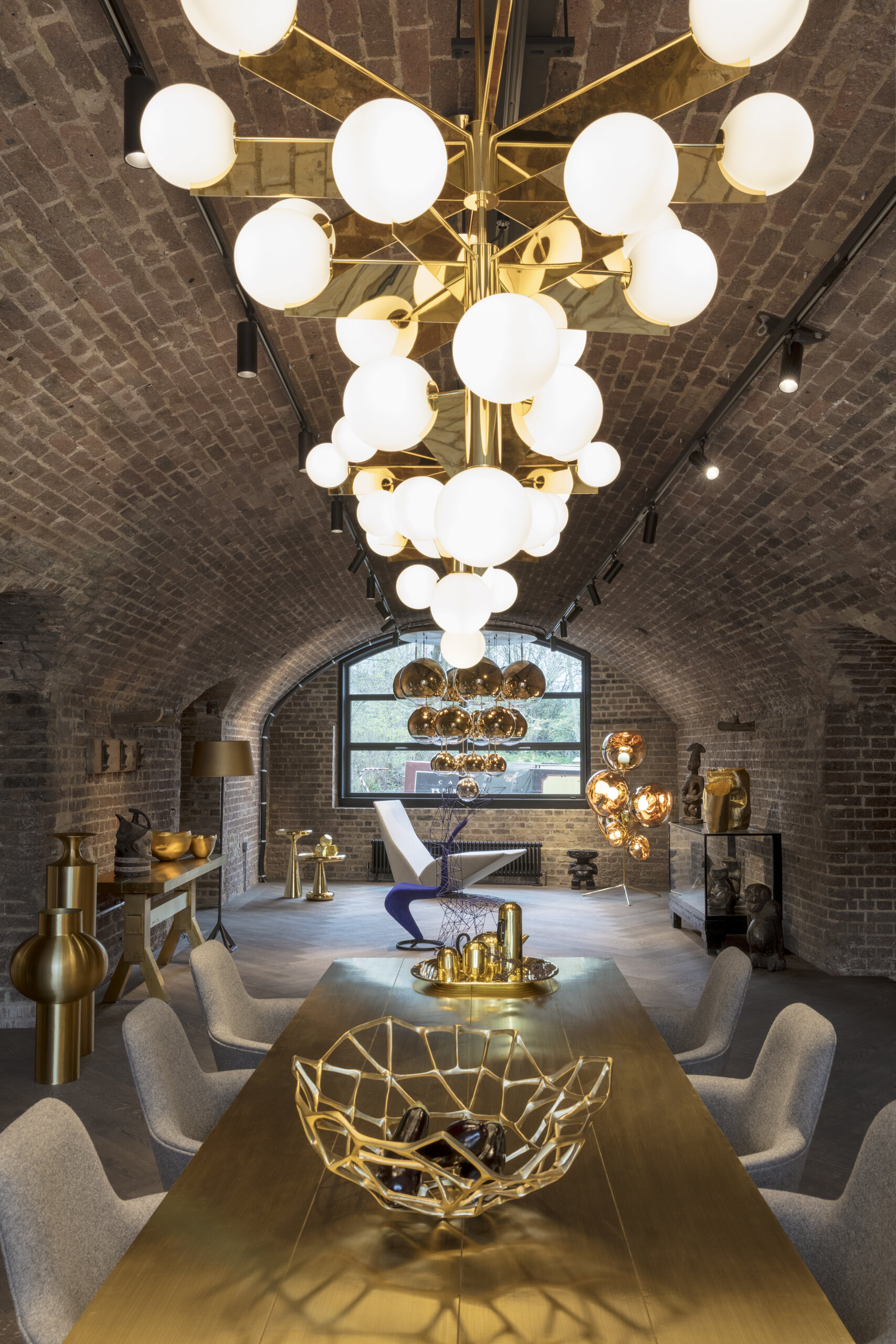
Later this month, the internationally renowned brand Tom Dixon opens it's doors to the design brands most ambitious development yet. Located in the heart of London’s Kings Cross, the new hub contributes to an ever-expanding network of creative businesses within the area. We were lucky enough to be invited to a private press-preview this week, for a first look at how the space has been transformed...
“For us it was imperative not just to find a new office or shop. It was vital to find a new home. London isn’t just another city. It is where it all started. We will use these 17,500 square feet in this incredible location as a platform to broadcast our latest ideas in interior design, product innovation and experiments in food, functionality and future living.”
Against an industrial backdrop the Coal Office is set to lead the way as a multi-disciplinary platform for innovation in design. The space will function as a live studio combined with a gift-shop, workshop and office all under one roof, with the culinary delights of a brand-new restaurant and roof terrace - to be launched later in the year, towards the end of June.
The Coal Office will serve as the ultimate centre for interiors, a journey through outstanding details from beginning to end. The lower ground store and showroom is a sensory journey, something which the iconic buildings architecture naturally lends itself to. A series of large archways split the space, allowing each sensory element to shine individually whilst harmoniously flowing into one another through the continued details of exposed brickwork and large-scale hardwood floors.
Each individual archway and the sensory visions of light, colour, tactility and scent within it, are all carefully considered in the new premises which notably isn't named after the Tom Dixon brand itself; a conscious decision to allow each element to breathe with room for creative collaborations from younger craft studios and complementary businesses; hand-selected for cohabitation by Tom Dixon personally.
In celebration of the unique history of the building, which dates back to 1851, edible installations celebrating the power of coal by food concept studio Arabeschi di Latte were served on the day, along with new product presentations and a tour by the designer himself. To preview the emotionally considered space before it opens to the general public at the end of this month, head over to our Instagram account here.
Opening Dates and Times
Shop Opening Date: Friday 20 April, Monday - Saturday 10am – 7pm, Sunday 11am – 4pm.
Restaurant: Opening late June 2018.
Address: Tom Dixon, The Coal Office, 1 Bagley Walk, London N1C 4PQ
Light; the power of life and illusion
Light. It’s a natural life source that we simply can’t live without. Even a house made of glass cannot guarantee sunny weather, which is why this weeks journal explores the importance of carefully considered lighting and its power of illusion...
Our eyes, the gateways to our souls - are just that; an external sense tool for understanding and observing, with the ability to teach and develop our internal consciousness. They say ‘seeing is believing’, which as a sentiment is true; sight, of all our senses, contributes the most to our overall awareness. It's the easiest of our senses to understand as we block visual stimuli without conscious thought and so we react much more easily to it than the other senses such as scent or tactility.
Question time
Even a house made of glass cannot guarantee sunny weather which is why our in-house interior design experts, Rachel and Claire, sat down to explain in more detail the importance of carefully considered lighting and the power of illusion...
1.
Lighting within the home is often an afterthought. There’s tendency to think more about colour, furniture and accessories rather than the crucial element of lighting. Why does lighting deserve more attention?
Lighting plays a significant role in how the mood of a room is created. Soft, low-level-lighting creates depth and tranquility within a space whereas high-level, bright, task-lighting would create the opposite effect. Lighting as a stand-alone element can be a form of art whilst defining a space, it can be playful but also sophisticated. The light emitted is undeniably important but so too is the design of the fixture itself. There’s nothing more impressive than walking into a room where stunning lighting designs have been carefully incorporated to enhance the other elements of the scheme, that we perhaps interact with more via our other sensory levels. - Rachel Usher.
2.
Lighting is defined within three different types; AMBIENT, task, and accent. Could you explain the difference between these?
Think of Ambient lighting as a foundation, it creates the overall distribution of illumination within a space. Ambient lighting comes in various guises from contemporary pendant lights to simple downlights but consideration of the spaces size and the influence of natural light within it should always inform how this type of lighting is used. It’s essential that the lighting levels are balanced to create a comfortable environment.
Task lightings purpose is practicality however if harnessed correctly, it can transforms a space into something that’s both beautiful and practical - think lighting under kitchen cabinets or carefully considered pathway lighting.
Accent lighting is the final layer, used to highlight key elements within a space. Up or downlights can be used to showcase a sculpture, a piece of art or a feature wall - the possibilities are endless. - Claire West
3.
What’s more important, utilising light to define reality within a space or creating illusion within it?
It’s dependant on how a client intends to utilise their space but, more often than not, the two should exist in conjunction. A bathroom for example may require crisp, clean lighting for practicality, used as a tool to benefit the function of that room. In most cases the same space is also required for relaxing and to create the required atmosphere different light systems would need to co-exist. Combining both types of lighting allows for flexibility within the space depending on how and why the client is using the room. - Rachel Usher
4.
When an illusion of light is needed how is this achieved?
Light and space are two of the most important things that we look for in a space. As designers we’re often asked to create an ‘illusion' of light and space where the environment naturally lacks this benefit. We consider the various elements that make up a space and carefully introduce different components to enhance it. For example, the scale of a timber floor plank, a light paint colour palette that flows from the walls and ceilings into the woodwork, mirrors and strategically placed furniture and lighting - all of these components lead the eye calmly around a space, creating an illusion. - Claire West
5.
What should be considered when the aim is to create a comforting home environment?
Lighting should exist on different levels. Mostly importantly consideration of how natural light works and feels within a space should be made and used as a starting point. Natural light will, naturally, change depending upon the time of day but also the aspect of the windows and the seasons.
Like the rest of a design scheme, lighting should be considered in layers, it’s more interesting if light derives from different sources whilst also allowing us to customise the light used depending on how the space needs to function at different times.
A light sources colour is really important too as our eyes see colour as a refraction of light. On a personal level, I find warmer lights much more comfortable and natural, it’s the type of light you would find in a south-facing room and makes colours appear more yellow in hue. Creating a comforting environment does however really depend on the individual. - Rachel Usher.
6.
Why is considered lighting within commercial spaces so important?
Regardless of how beautiful an interior scheme is, if lighting has not been carefully considered the space will fail. Just like residential properties there are two fundamentals which need to be considered; form and function. Ambient and task lighting should be used to give an overall, practical illumination, designed to meet the needs of the space from a functional point of view, whether that be a workspace or a restaurant. Accent lighting should also be applied to reinforce the brands identity and to create the desired atmosphere. The style of light, its scale, positioning and the quantity used should all be mindfully considered. - Claire West
7.
Should lighting be harnessed uniquely depending the type of commercial space, for example restaurants and workspaces or should the emotional needs of the space be the main priority?
Lighting design is an art form in itself, on large residential and commercial schemes we would work closely with a lighting consultant to ensure the lighting is designed to meet the project requirements, both from a practical and emotive perspective. All spaces need emotive consideration, creating an atmosphere which relates to the service is paramount to its success, forming a space that people enjoy spending their time. - Claire West
8.
Can you think you of a residential or commercial project where the lighting design has had a significant impact on the emotive experience of the space?
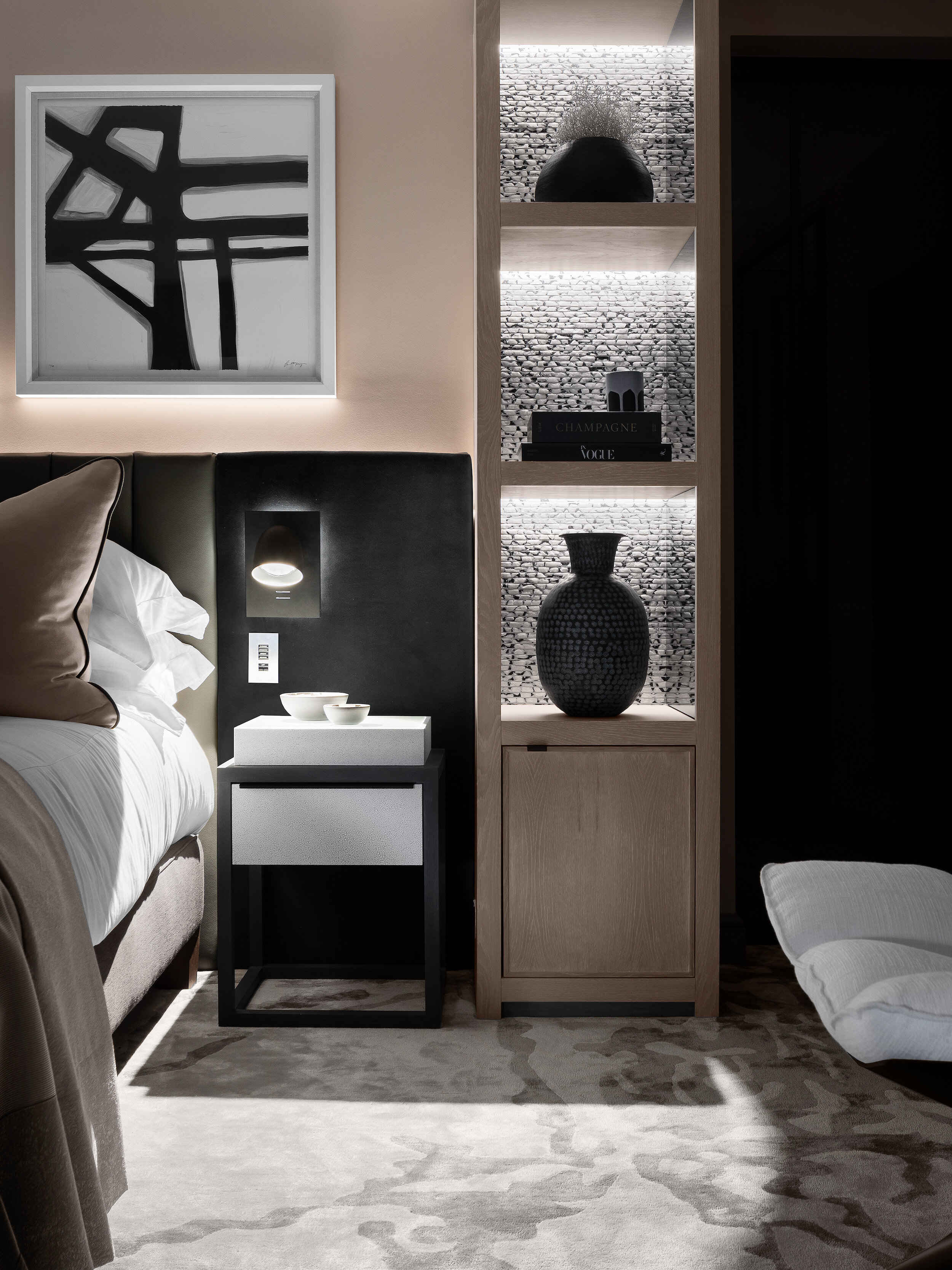
On a recent project we have specified some architectural lighting, hidden into wall recesses and joinery details. The overall flow through the property has been connected with the hidden features and washes of light, emphasising the beauty of the interior architecture and creating a home that feels restful, contemporary and sophisticated. - Rachel Usher.
9.
How should outdoor lighting be approached?
Outside lighting can be considered from a number of perspectives; directional, architectural and accent, all of which require tones of light from multiple sources.
For properties with long sweeping driveways lighting can be utilised practically as a guide towards a property. Architectural lighting can be used to wash areas of a building in light, highlighting architectural features, defining its shape and form. Accent lighting is most often used to bring landscaped areas to life. Low-level lights which bathe trees and external features in a light glow can make the most out of an external space when it would otherwise be under the cover of darkness.
For commercial projects, well specified external lighting can make all the difference in how inviting or dramatic a venue appears and lighting choices should be a key consideration as part of the overall design; holistically considered. - Rachel Usher
10.
Which three lighting brands or designers are you particularly found of and why?
I still love the clean-lines deriving from Scandinavia so Normann Copenhagen and Vita Copenhagen are firm favourites of mine. I also love Northern Lighting’s Acorn Pendant by Atle Tveit - they’re installed in my kitchen at home and I LOVE them.
I will always support British brands where I can, I really respect how the self-taught Tom Dixon is progressing aesthetically; innovative, sculptural and yet always elegant. Another British company I love to work with is CTO, a company that allow us to customise fittings to our clients bespoke requirements. Sorry, I couldn't name just three… - Claire West
A conscious focus on tactile interiors
Simply looking at something often isn’t enough. Aesthetics are important but our curious nature often directs the most important of all our senses, touch...
Identifying if a space looks good is easy. Understanding why we feel positively connected to it is more complex...
As Humans we have evolved using the sensory stimulations we’re surrounded by and, more often than not, we subconsciously measure a space and define its value to us based on our emotive experience.
When we visually absorb textures our minds automatically lead us to thinking about how surfaces feel to touch. We make assumptions on what a texture may feel like based on memories of tactile surfaces we’ve made contact with before.
Our sensory stimulations can work for, or against us
Harnessing tactility within a space is integral in forming a comfortable environment; whether that be warm and relaxing or cool and light. When consideration for the touchy-feely elements are ignored the opposite occurs; creating a space you inhabit rather than experience.
Surface textures are a fundamental element within interior design as they form the visual temperature of a room. Smooth surfaces for example reflect light and provide a cooler, more open impression whereas raised textures, which absorb light, convey a sense of warmth and relaxation.
Look around and you’ll see tactile elements are applied in more places than you might think; walls, ceilings, flooring, furniture and even the exterior of a building all incompass textural components. Where we apply texture can change our perception of it; how light interacts with a surface and how closely we interact with it heavily influences our emotive response.
When selecting tactile elements it’s important to incorporate complementary textures, that play off of each others distinctions; creating a balanced environment. Rough surfaces for example can seem much more textured next to a smooth surface, which depending on the needs of the space; could work for or against you.
Carpet is another great example as naturally it reflects far less light than a hard-wooden floor so the furniture, wall coverings, lighting and accessories used alongside carpet flooring should incorporate smoother textures to provide much needed light. Naturally, the opposite applies for hard-wooden floors where softer components should be combined to create harmony within the space.
The tactility of natural materials provide countless benefits
The natural origin of wood makes it a warm and comforting material. Countries such as Norway, Canada and Denmark all utilise wood both within interior design and exterior architecture, taking advantage of the endless surface-texture possibilities wood can provide. These countries have also studied the effects of wood within our living environments extensively, some even recording a drop in blood pressure when used in health related spaces.
Natural stone is another material that offers a wide spectrum of choices in terms of textural aesthetics and holds the added benefits of durability, conducting heat and being naturally soundproof.
A successful interior should enhance the way you experience a space and reflect your individuality
It’s important that you’re able to fully visualise a project and as our reaction to texture is so incredible personal; it’s equally important that you’re able touch and interact with the textures we’ve hand selected for you. Carefully curating digital and textural style-boards are all part of the high-level service we provide at Rachel Usher Interior Design, whether we’re working with high-end residential homes or luxury commercial projects such as hospitality spaces and restaurants.
We’re passionate about creating considered interiors which reflect your individuality and enhance your interior experience. Our talented team have over 30 years experience and implement projects with a consistent level of devoted attention and detail; creating spaces which are more than somewhere you simply inhabit...
Curating colour for a home that will nourish your soul
Intelligent design harnesses the power of colour, forming a balance between visual-aspirations and nourishment of the soul; for a purposeful, passionate and peaceful life...
Colour, put simply, is energy formed from light of varying wavelengths. Each colour is materialised by its own unique wavelength and therefore unique energy; each impacting our visual senses significantly.
Dating back thousands of years chromotherapists, or colour therapists, have been known to harness colour and its energy holistically, utilising it as a non-invasive and powerful therapy for finding balance and harmony; positively affecting both the mind and body. Each colour is thought to hold its own benefits based on where they appear within the visible spectrum. Cooler colours red, orange and yellow are located at the top of our visual spectrum, providing stimulating effects. Red, activates and revitalises, orange holds the power to restore whilst yellow fortifies and brightens our inner-self. Lowest on the visual spectrum are the warmer colours, providing calming effects; blue soothes and relaxes, indigo provides purity and focus and violet is there to inspire and support us. Green is located in the middle of the warm and cooler hues, it's power considered a great balance force, harmonious by nature much like nature itself.
How we view colour and its effects should be something we carefully consider, utilising these hidden powers to create the specific mood or feeling required from a space, a mindful masterpiece if you will. The balanced and relaxing nature of green for example would be ideal for living or bedroom spaces whilst blue is possibly more ideal for creating a soothing atmosphere in a luxury bathroom.
White contains all the colours within the visual spectrum, emphasizing purity and providing clarity to our thoughts. This could be the reason why white is so prevalent in Scandinavia, home to some of the best furniture and product designers in the world who apply a heightened level of detail to their considered and simplistic pieces.
Recently however a notable shift has formed within Scandinavian culture with an evident increase in stronger, bolder hues being adopted. Their love of classic pieces of furniture and lighting and their ease of access to it has uniquely allowed them to experiment with colour without the need to redesign their space from scratch. They are able to change the mood of a space using just colour, compensating for the harsh meteorological seasons that dictate their daily lives, whilst incorporating consistently their classic items of furniture. Short days during the winter season force Scandinavians to constantly seek light, in contrast to the summer months where the days draw-out long into the night. A simple refresh of paint work at home can be used easily to balance this, creating interior harmony that doesn’t continually exist outside.
Quality in the colours used is equally important. Here at Rachel Usher Interior Design we regularly use British paint manufacturer Little Greene, who offer luxury paints whilst remaining committed to socially and environmentally responsible production. For commercial projects Paint and Paper Library is our brand of choice; their paints officially accredited by the Royal Institute of British Architects. Both brands are available to order and collect from our Bawtry Interior Design Studio in Doncaster, if you’re in need of some sage advice selecting colours however, please do get in touch before visiting us.
Whilst our reactions are instinctive to colour based on their unique wavelengths and energy, curating colour combinations can be particularly difficult to navigate. We're proud to offer a colour consultation service, approaching colour in a way that’s personalised to you, informing the mood of your space and ultimately nourishing your soul.
An emotionally considered home
A successful interior scheme enhances the way you experience a space whilst reflecting your individuality. We explore the importance of design that’s emotionally considered.
When designing a space it’s important to look attentively at all the various elements of a room. Practicality is important but consideration of the mood and the various senses that form this are equally significant in the design process; including intangible components such as scent. We are of course, all different. Individuality should direct how each sense is harnessed to form a nurturing, emotional connection; customising the space to create a unique experience. Rachel Usher explains;
“Design affects our senses, whether that be in the way that we interact with light and space, the texture of materials or the furnishings used; all of these elements directly affect the comfort & purpose of a space, relating to how we feel and influencing our emotional wellbeing
”
For most of us, escaping the stresses of daily life is the most important factor we look for in our home environments and understanding the different senses we’re surround by in our dwellings is a good place to start in creating a mindful space.
Our vision senses have the ability to change our behaviour, how we interact with light for instance can dramatically influence our sleeping behaviour; for a relaxing evening it’s best to avoid bright LED lights as the blue wavelengths keeps us alert, confusing our natural body clocks and would be better served in an office space where productivity is key. Lamps or candles that emit a warm glow are more ideal for winding down at night and the spaces we gravitate towards in the evening should take this into consideration.
Colour informs every aspect of our daily lives, our reactions are often emotional but also intuitive, without us even noticing. We’re often drawn to colours we like without considering their impact; where and how colour is used should again be mindfully considered.
“It is the interplay with our senses that creates an experience, for example the use of colour can evoke feelings of warmth and comfort if applied correctly; considering the size and purpose of the space”
Although intangible, our sense of smell has the ability to provoke deep emotions within our brain and likes or dislikes are often based purely on these emotional associations.
Harnessing our sense of smell is incredibly important, scents have an ability quite unlike anything else; to unlock memories and transport us perhaps to a time and place long forgotten.
“The scent of a space’s is as fundamental to the success of a design as the use of colour or texture”
Notably, our sense of touch is the most significant as our entire body is receptive to tactile qualities. We are directly affected by the use of different materials and respond to them, again, in an often personal way. We learn from our sense of touch and make judgments from these, developing deep associations which directly affect our thoughts and feelings.
So when designing a space, whether that be a home or social environment it’s undeniably important that emotional needs are fully considered. Our wants often over-power our needs but by acknowledging these personal feelings and reactions we’re able to ensure that both align; providing balance.
Designing an emotionally considered space is important, after all, you literally have to live with it. If you’re in the need of professional expertise please do get in touch; our interior design services are flexible, allowing us the freedom to cater to projects of various sizes. We work closely with all of our clients to realise imaginative spaces which truly reflect your vision and aspirations to enhance your at-home-experience.


