Sustainable Paint; Where creativity and responsibility unite
You will already be aware of the transforming effects a simple coat of paint can provide to a space. The toxic components used to create many well-known paint products however are generally not acknowledged, causing damaging environmental effects to our planet. In 2018 ignorance is no longer bliss and so this weeks journal entry explores the importance and benefits of luxury eco-paint; a product that remains creative whilst honouring our environmental responsibility.
Sustainable Paint; Where creativity and responsibility unite.
In 2018 ignorance is no longer bliss. The importance of environmentally responsible products is gaining momentum, luxury paints included, but identifying brands which produce with minimum ecological impact can still be notoriously difficult...
How paints are formulated isn’t something most people are acutely aware of - or even think to question yet the reality is most well-known paint producers create their colour ranges with toxic chemicals which are not only bad for the environment but also our own health.
Most modern-day manufacturers create their paints using the three main components of pigment, binder and a carrier. Many of the ingredients used within these combine toxic chemicals such as cadmium, lead, chromium, petrochemicals, solvents, benzene, and formaldehyde as well as volatile organic compounds otherwise known as VOCs. Whilst organic, the chemical compounds of VOCs evaporate easily into the atmosphere and so are a particular concern environmentally, contributing to climate change.
Numerous health problems are linked to these chemicals, from less severe issues such as eye irritation to problems much more serious; respiratory disease, asthma, skin disorders, liver or kidney damage and even cancer. The most concerning aspect of these chemicals however is the fact that many paints continue to emit dangerous VOCs years after their initial application.
Due to rising industry concerns environmental regulations have been put in place, forcing paint manufacturers to reduce their VOC content however many brands still include solvents and chemical pigments.
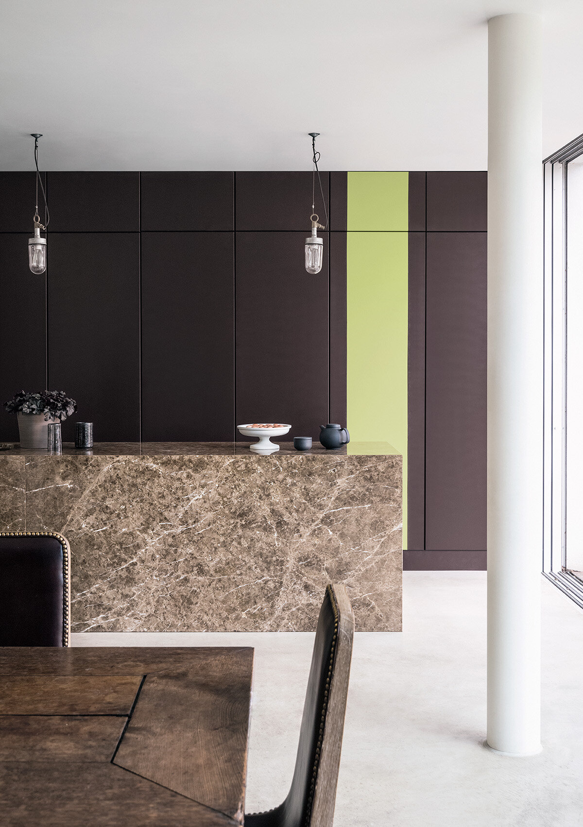
There are however a handful of brands who are pioneering with non-toxic paints, acting positively and responsibly to minimize the ecological impact paint has to both ourselves and the wider environment. Two brands in particular, Little Greene and Paint & Paper Library are revolutionary in their approach, producing luxury, high quality paints which remain creatively progressive whilst honouring their social commitments.
Little Greene
Little Greene are a brand whose philosophy is centered around a commitment to protecting the environment and in 2004 they were one of the first brands to achieve the required environmental standards. Every aspect of their business is considered against this philosophy whilst ensuring no compromises are made within the products they manufacture.
Little Greene's water- based paints carry the paint industry's lowest eco-rating with VOC content at virtually zero. This eliminates any concerns regarding solvents releasing into the atmosphere and any respiratory issues which could otherwise have been affected. Oil-based paints are formulated using sustainable vegetable oils without compromise on quality, renowned within the industry for their superior finish and longevity.
Paint tins are produced using recycled steel with the added benefit of being able to be recycled again after use - another instance where Little Greene strives in comparison to their competitors. The company has also recently moved into a new head quarters located in Manchester, designed specifically around their eco-values with solar powered energy for both their general offices and paint manufacturing.
Paint and Paper Library
Paint and Paper Library are another brand whose values align with long-term environmental sustainability:
“With creativity comes responsibility and with beauty comes duty. We make every effort to minimise any negative impact on the environment and health.”
Every product they produce is made by traditional methods, incorporating eco-friendly ingredients which not only make a visual impact but positively exceed current environmental regulations, including VOC.
Sustainable Paint Stockist
Little Greene and Paint & Paper Library are two brands we regularly specify within our projects, not only for aesthetic appeal but for the numerous health benefits too - which improve the overall experience of any space.
We’re also prestigiously part of both brands carefully curated stockists and so we’re able to the supply to the general public. As part of our own environmental commitments all paints are made-for-you with fast-tracked delivery.
Our studio is open Monday-Friday 9-5, for further information please get in touch via our contact form.

Curating colour for a home that will nourish your soul
Intelligent design harnesses the power of colour, forming a balance between visual-aspirations and nourishment of the soul; for a purposeful, passionate and peaceful life...

Acknowledging the power of colour, and it’s perhaps unexpected connection to our emotions, allows us to realise its full potential.
The impact of colour on our daily lives is often instinctive, subconscious and undoubtedly emotive, but why?
Colour, put simply, is energy formed from light of varying wavelengths. Each colour is materialised by its own unique wavelength and therefore unique energy; each impacting our visual senses significantly.
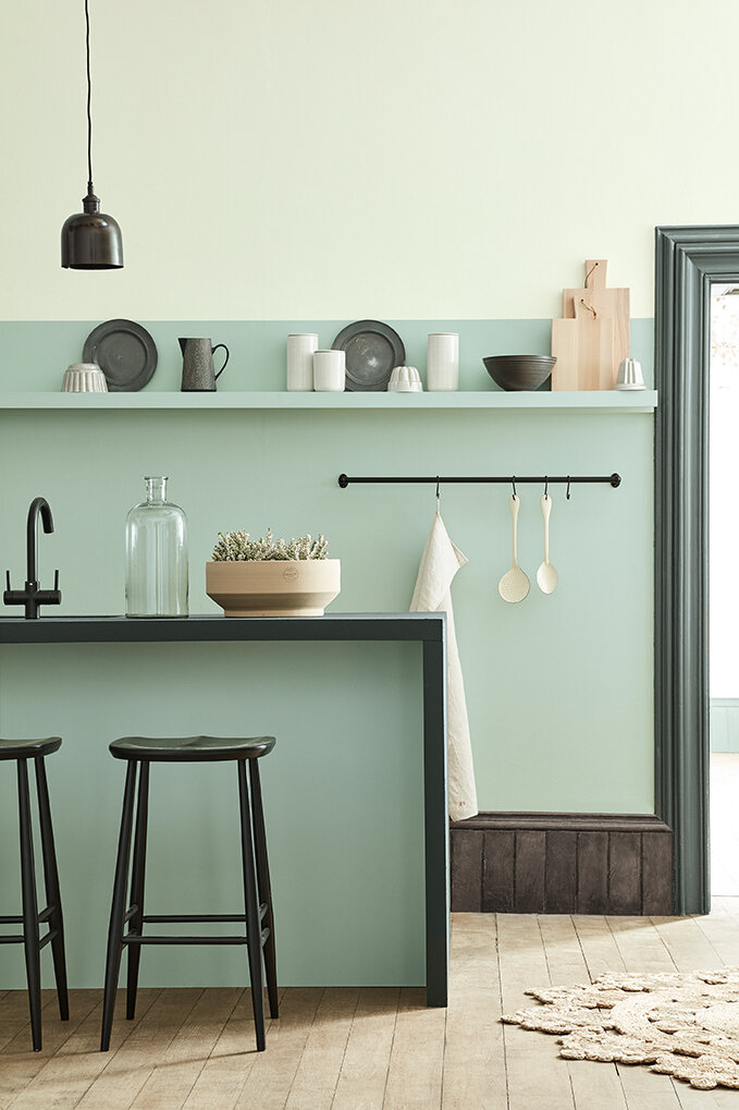
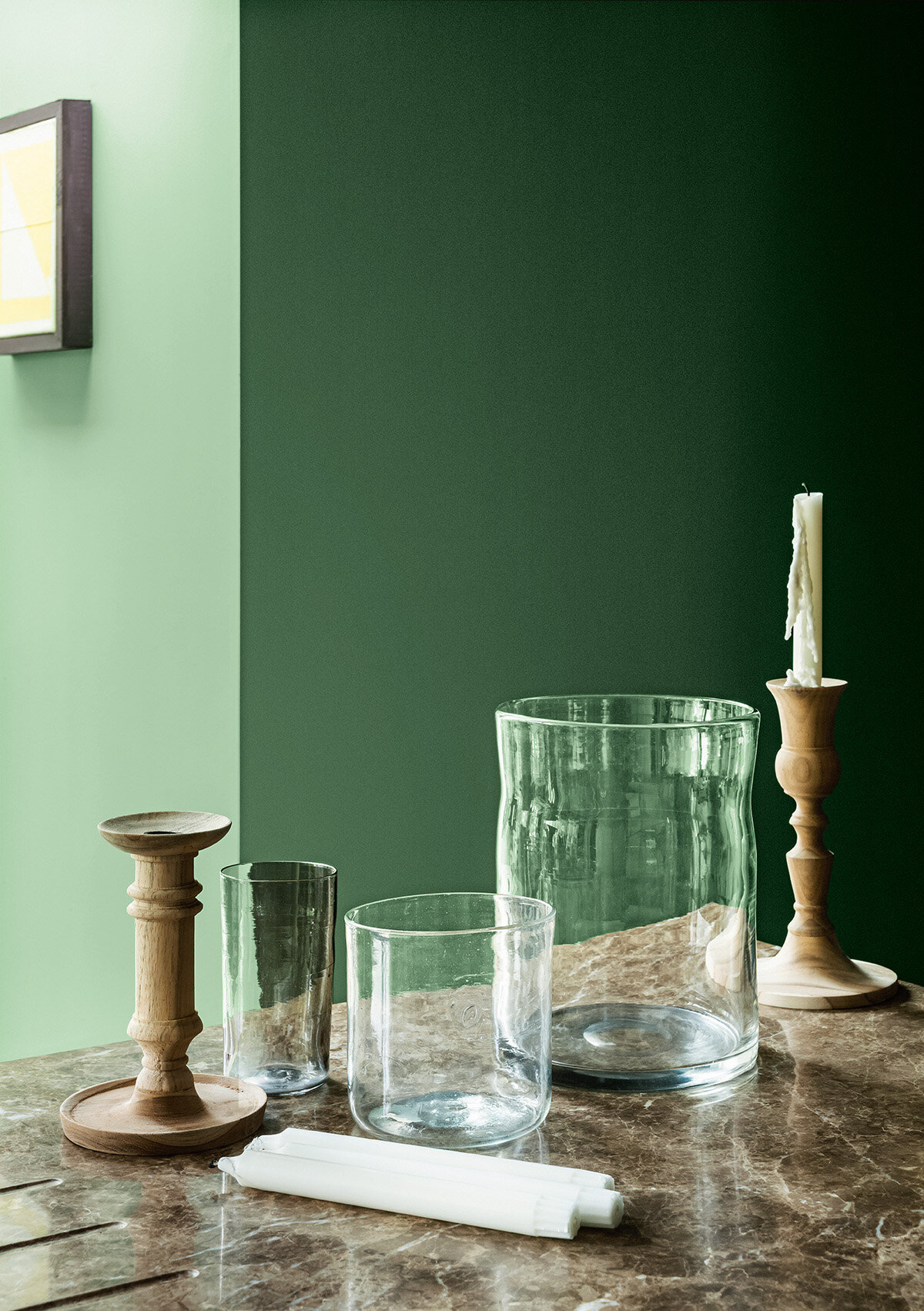
Dating back thousands of years chromotherapists, or colour therapists, have been known to harness colour and its energy holistically, utilising it as a non-invasive and powerful therapy for finding balance and harmony; positively affecting both the mind and body. Each colour is thought to hold its own benefits based on where they appear within the visible spectrum. Cooler colours red, orange and yellow are located at the top of our visual spectrum, providing stimulating effects. Red, activates and revitalises, orange holds the power to restore whilst yellow fortifies and brightens our inner-self. Lowest on the visual spectrum are the warmer colours, providing calming effects; blue soothes and relaxes, indigo provides purity and focus and violet is there to inspire and support us. Green is located in the middle of the warm and cooler hues, it's power considered a great balance force, harmonious by nature much like nature itself.
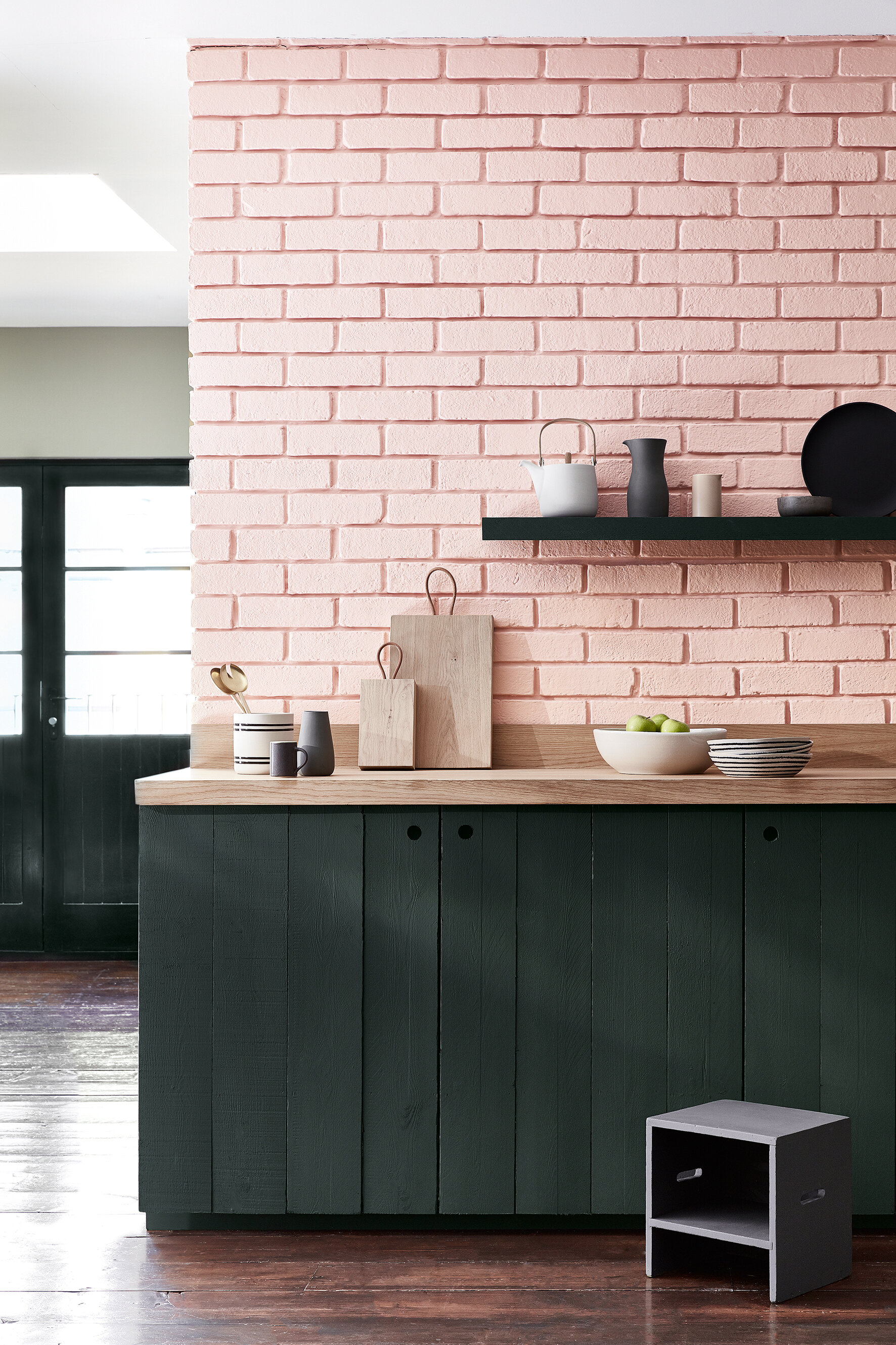
How we view colour and its effects should be something we carefully consider, utilising these hidden powers to create the specific mood or feeling required from a space, a mindful masterpiece if you will. The balanced and relaxing nature of green for example would be ideal for living or bedroom spaces whilst blue is possibly more ideal for creating a soothing atmosphere in a luxury bathroom.
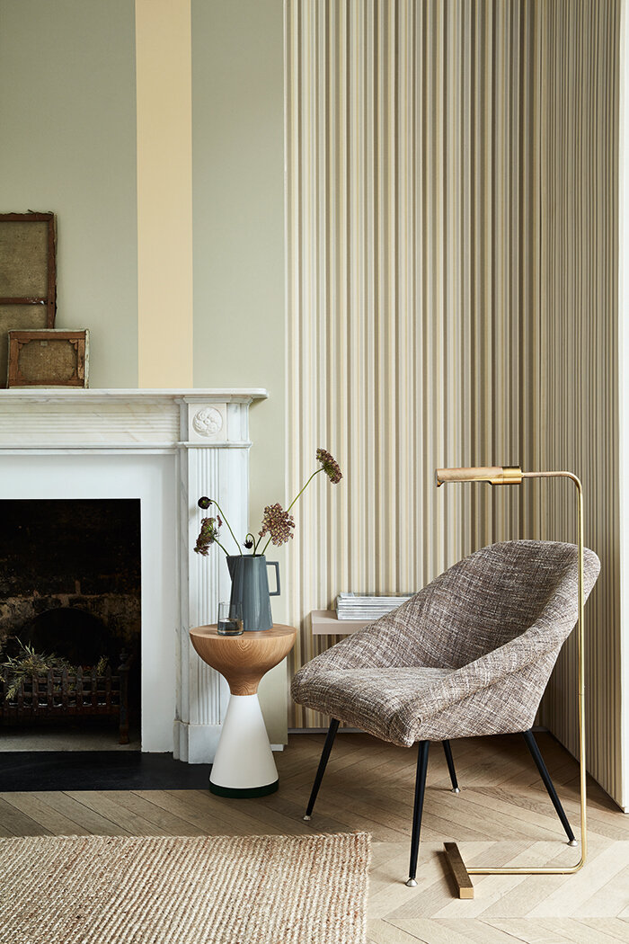
White contains all the colours within the visual spectrum, emphasizing purity and providing clarity to our thoughts. This could be the reason why white is so prevalent in Scandinavia, home to some of the best furniture and product designers in the world who apply a heightened level of detail to their considered and simplistic pieces.
Recently however a notable shift has formed within Scandinavian culture with an evident increase in stronger, bolder hues being adopted. Their love of classic pieces of furniture and lighting and their ease of access to it has uniquely allowed them to experiment with colour without the need to redesign their space from scratch. They are able to change the mood of a space using just colour, compensating for the harsh meteorological seasons that dictate their daily lives, whilst incorporating consistently their classic items of furniture. Short days during the winter season force Scandinavians to constantly seek light, in contrast to the summer months where the days draw-out long into the night. A simple refresh of paint work at home can be used easily to balance this, creating interior harmony that doesn’t continually exist outside.
Quality in the colours used is equally important. Here at Rachel Usher Interior Design we regularly use British paint manufacturer Little Greene, who offer luxury paints whilst remaining committed to socially and environmentally responsible production. For commercial projects Paint and Paper Library is our brand of choice; their paints officially accredited by the Royal Institute of British Architects. Both brands are available to order and collect from our Bawtry Interior Design Studio in Doncaster, if you’re in need of some sage advice selecting colours however, please do get in touch before visiting us.
Whilst our reactions are instinctive to colour based on their unique wavelengths and energy, curating colour combinations can be particularly difficult to navigate. We're proud to offer a colour consultation service, approaching colour in a way that’s personalised to you, informing the mood of your space and ultimately nourishing your soul.