Triennial Bruges; Architectural artworks
Ever since Triennial Bruges inaugural 2015 debut, contemporary architects and artists from across the globe have been invited to the city, commissioned to create experience based constructions which encourage a thought-provoking social atmosphere. This year, with the overarching theme of ‘Liquid society’, Triennial contemplates our rapidly changing world; as established ways of life are under pressure, what does the future hold?
International artists and architects were invited to think about this question, in particular the consequences of liquidity in the city, in an age where nothing seems certain. The result is 15 works of art, installations and social spaces spanning across the historic city in perhaps unexpected places. The objective is to encourage people not only to view each artwork but to experience them and become part of the creative process. Here's what we think are the top five architectural experiences from the pavilions showcased...
1.
OBBA - The Floating Island
Designed by Sojung Lee and Sangjoon Kwak, the duo behind Korean architectural firm OBBA, ‘The Floating Island’ makes walking on water a reality. Located on the canals near Snaggaardbruf, the environment provides a whole new perspective of the city, covering over 100 square metres. The installation is surrounded by green islands, all accessible to the public to take a break, stroll along or make time for enjoying the surroundings - relaxing on hammocks or couches which lean right over the water.
2.
Renato Nicolodi - Acheron I
With several solo exhibitions under his belt, Belgian artist Renato Nicolodi is already well known for his sculptural installations. Acheron I is an installation in the canal, a sombre concrete pavilion leading visitors towards the water - inspired by the Greek word achos; a mythological “river of sorrow” that’s believed to give access to the underworld. The sculpture is intended to “Represent a haven, a gateway between the present, future and the past”.
3.
Selgascano - Selgascano Pavilion
Spanish architects José Selgas and Lucía Cano of Selgascano Studio are well known for their use of synthetic materials and innovative technologies within design and the Selgascano Pavilion is no exception. Constructed in transparent vinyl, the organic installation floats between the city’s brick buildings along the canal as a spot to stop and take time to absorb the historic surroundings. The location on the canal, which is mostly closed off from the main links, allows for people to wade in or even swim. - subject to water the quality on the day.
4.
Jarosław Kozakiewicz - Brug
Jarosław creates a contemporary interpretation of the many bridges which span the canal network across the city centre . The artist’s use of metal profiles and canvas creates a bridge which is functional, allowing people to cross, whilst encouraging a brief pause as the installation ends viewing the statue of Niobe by Constant Permeke. The structures design is based upon a proportional system linking to the human face which Jarosław uses as a metaphor for mutual encounters between human beings from the future and past.
5.
John Powers - Lanchals
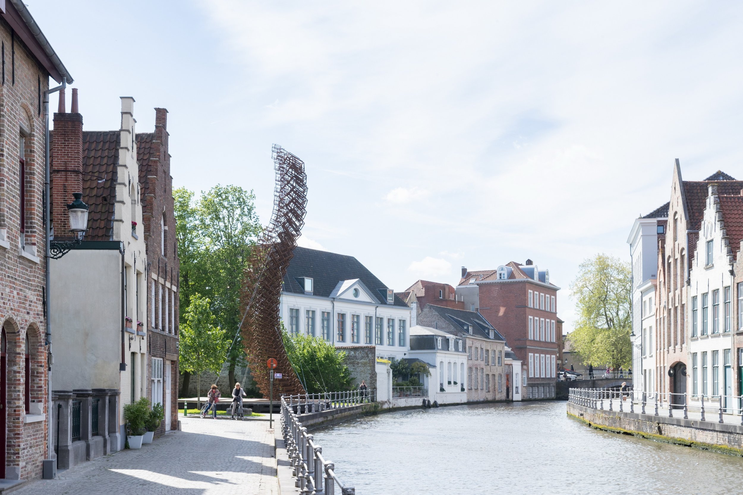
The New York-based artist John Powers draws inspiration from the rich history and folklore of Bruges to create the architectural installation; Lanchals. Erecting a meter-high sculpture in the form of a swan’s neck, Power’s links the the piece to the Archduke Maximilian Pieter Lanchals who was killed during an uprising in the 15th century against urban privileges - Legend has it that in memory of this event, the city had to allow 52 swans on to the various canals.
Triennial Bruges 2018 is open to the general public until 16 September 2018. For more information and specific event experiences head to the official Triennial website.
The Simple Life; soothe your senses
In a volatile world our quest for contentment can, at times, feel out of reach. Embracing an ethos of simplicity by acknowledging our needs over our wants, can in many ways counteract this struggle to find peace, soothing the senses for everlasting satisfaction…
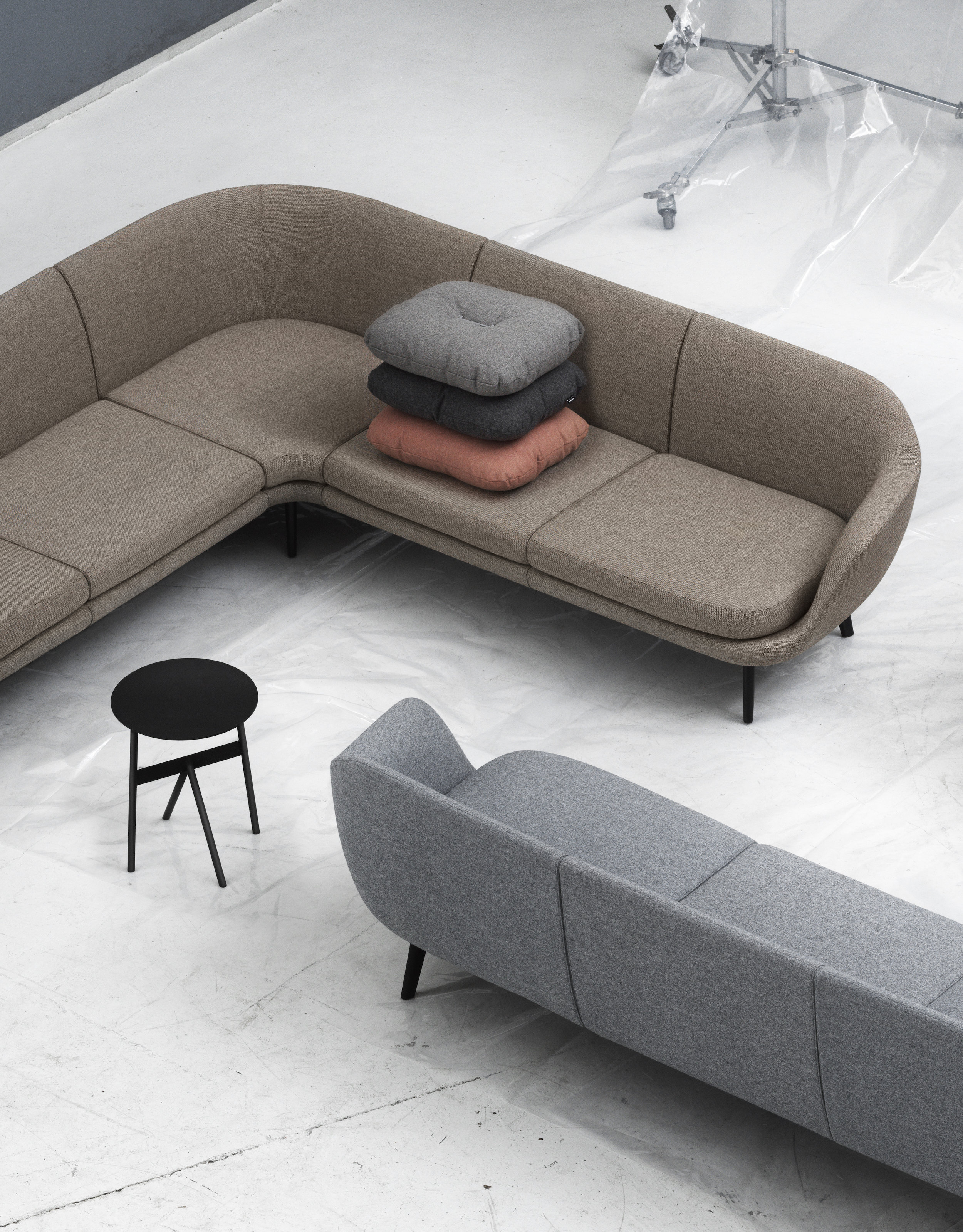
Simplicity, as an ethos, has particular resonance within the world of interior design.
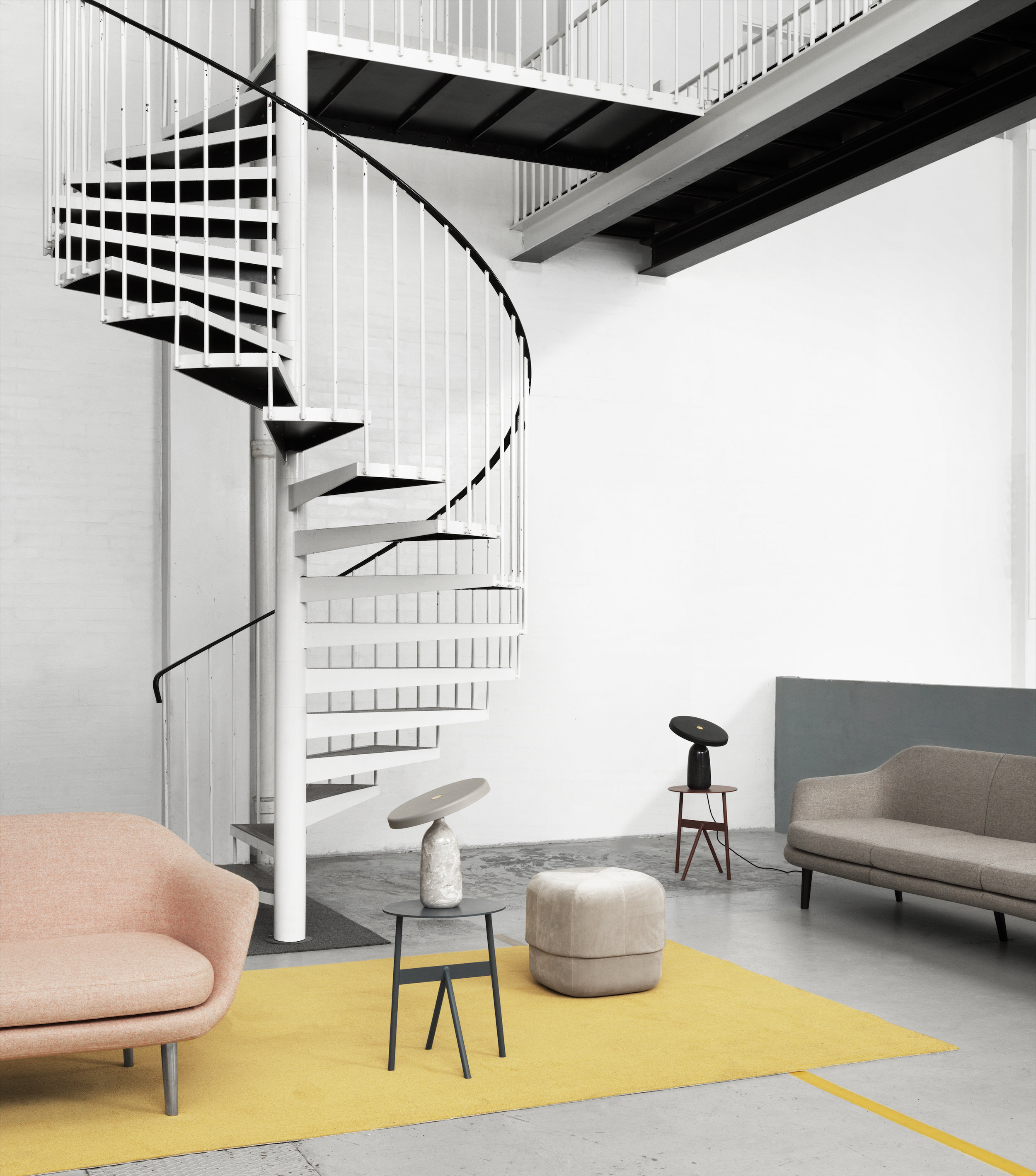
Is less more? It’s sentiment that’s often associated with minimalism but leading a simpler life doesn’t necessarily have to involve a barely-there aesthetic. It can be soothing, not sterile, providing a calm canvas that’s curated through mindful choices which acknowledge our needs before our wants.
Not filling our homes with mindless ‘stuff’ provides invaluable benefits, allowing a space to breathe which subsequently highlights the design choices made within it. The average house has 300,000 objects inside, most of which rarely add any value in our day-to-day lives. An appreciation of object’s and their narrative value, whether that be collectables or iconic furniture design, is integral as an approach when crafting a space to leaves us filled with contentment.
Sustainable Style
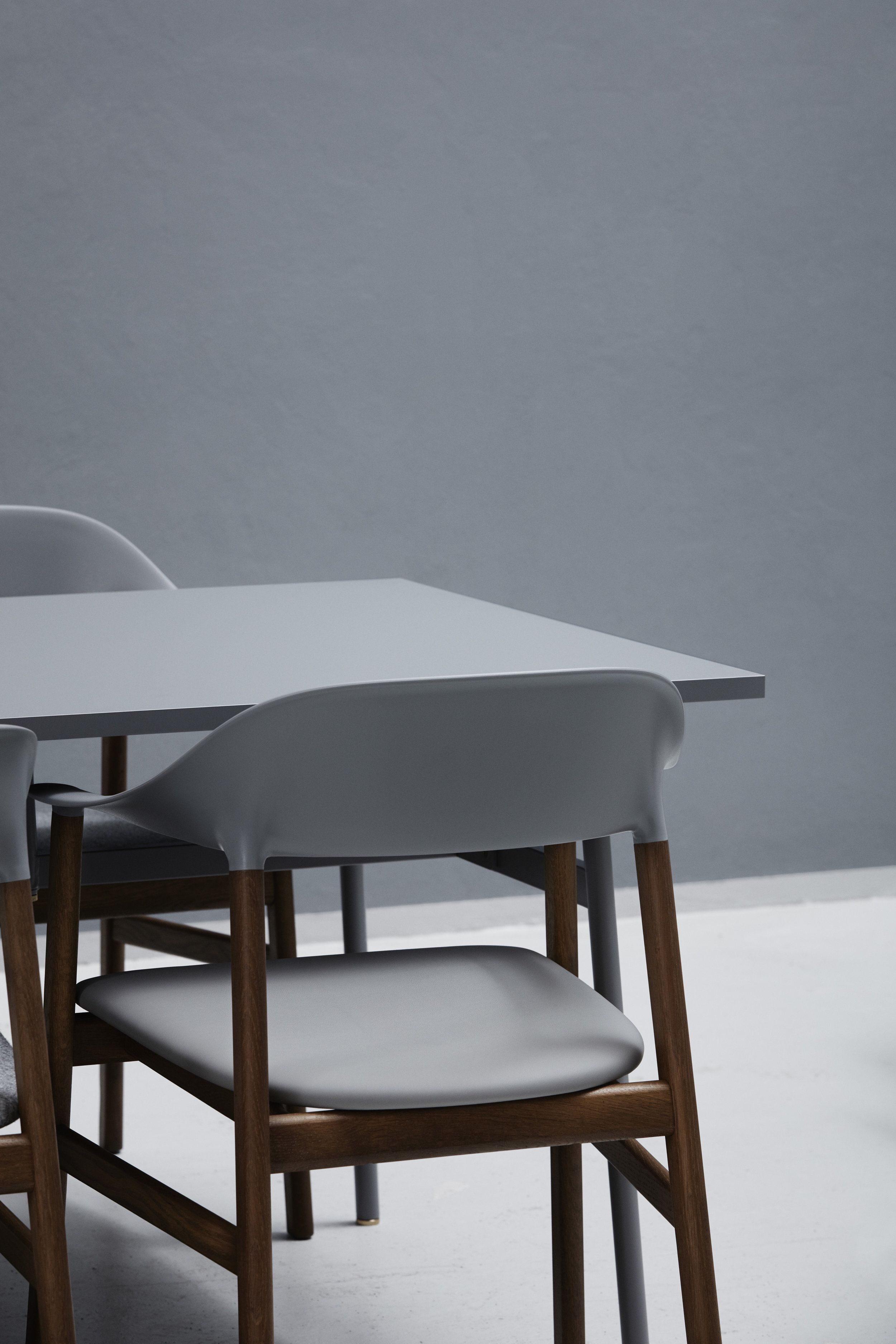
Our emotive response to the elements used within a space is influenced by how we interact with them, on a functional level and so investing in key, high-quality items is undoubtedly important.
Appreciating the craftsmanship and skill needed to create iconic design and the inevitable cost involved should be viewed as an investment - a word not used lightly. Most noteworthy design brands increase prices year-on-year, allowing the everlasting designs that they produce to retain their value if resold at a later date. Carefully selecting quality elements which provide purpose as well as sustainable style not only last a lifetime but as a result also become part of our lives, our story, and we form a deeper emotional connection to a space overall as a result.
Modern Simplicity
Lighting is particularly significant when creating modern simplicity. Often appearing pared-back, accent and task lighting is in-fact applied with great attention to detail, achieved through mindful decisions with results not dissimilar to statement lighting. Cleverly coupling functional elements with hidden lighting such as mirrors, cabinetry or structural components enhances their purpose elegantly, adding immense value to them and in turn, our lives. Human interaction with directional lighting is equally important. The ability to adjust lighting according to a spaces needs again assists with the functionality of a space whilst reducing the number of individual lighting components needed.
Cohesive Colour
Curating colour that will nourish your soul can too be approached in a simple way by harnessing colours holistically according to the needs of a space. Our minds naturally associate simplicity and balance with stereotypical stark whites but in reality colour and hue selections, if considered, can provide calmness and a feeling of contentment too. Applying single use colour, known as a monochromatic scheme, can be used with great effect to simplify a space, as can picking contrast colours with the same depth or tone; this cohesion providing a sense stability.
Interior symmetry
Symmetrical balance is integral when creating a simple, serene space. Repetition or mirroring along a central axis is often seen in nature, ourselves included, making the process of how we view visuals much simpler and what we see more memorable. We’re able to focus clearly on individual elements with the amount we see kept to a minimum and these measured choices soothe our senses, leaving us with the contentment needed for true happiness...
simplicity inspiration
Browse through our Pinterest boards here.


