Milan moments; Our highlights from the world’s most influential design week
Each year the eyes of the design world firmly fix on Milans prestigious Salone del Mobile, the busiest design week on the interiors calendar. This year, we headed over to Milans creative districts ourselves, in search of the latest inspiration from the exhibition itself as well pop-ups, installations and more.
Milan's Salone del Mobile is an unmissable event.
It’s the busiest design week within the interiors calendar, on an international level, showcasing and celebrating creativity, innovation and quality in equal measure. Noting just six top highlights from the world’s most influential design week was, quite frankly, difficult but you will see one common characteristic found throughout this years showcase; the revival of an objects narrative value.
1.
Wallpaper Handmade - a world of wellness
Wallpaper magazine’s iconic installation dedicated itself this year to curating a sanctuary for the self with ‘Wellness and Wonder’; a specially commissioned collection of designs by skilled makers from across the globe.
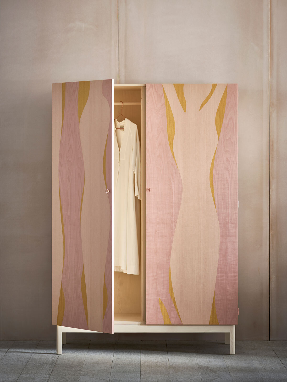
British design studio Pinch London were a particular highlight, a brand created to enhance our daily lives with a core focus on warmth, substance and most importantly the human experience. Aiming to encourage and enable users to live well through carefully crafted design, Pinch showcased the new ‘Elan Armoire’ cupboard which utilised dynamic marquetry techniques to create a truly considered design inside and out. The British brand are also able to colour match to all Paint & Paper Library colour references for those in favour a monochromatic interior scheme...
2.
Nature invading
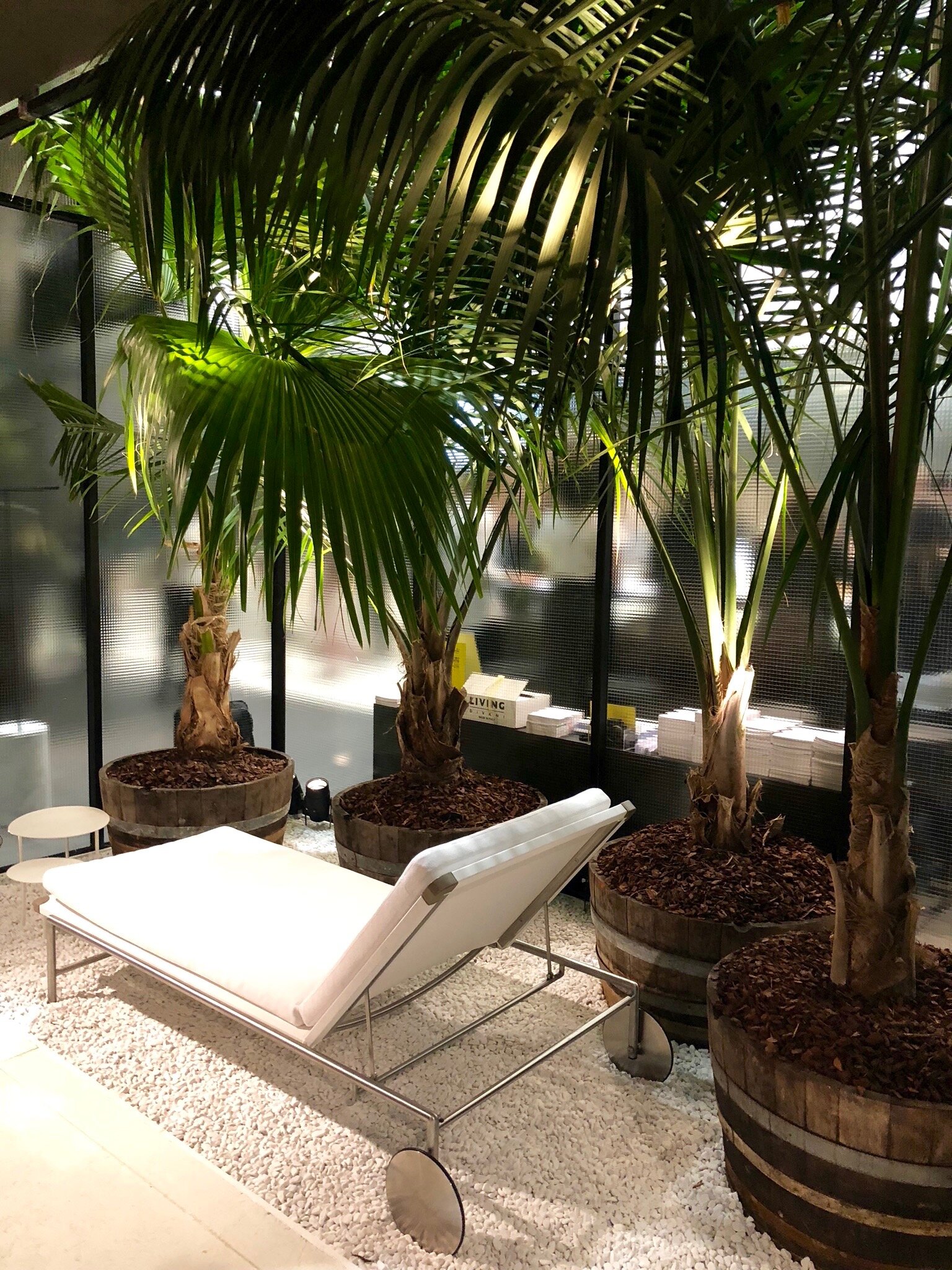
Interior botanicals have grown and multiplied - an organic progression for the plant trend that’s become a mainstay in most homes. The use of large-scale tropical plants, grouped and clustered, could be seen almost everywhere with a clear focus towards architectural styles, something previously highlighted during our visit to Tom Dixon’s, The Coal House.
The continued relevance of nature is based on our experience with greenery itself, which is instinctive, garnering dramatic effects on our emotional wellbeing and reducing stress; whether that be at work or in a home environment. We’ve already made a conscious effort to grow our own indoor-jungle at the studio, utilising nature to curate an impactful visual with holistic benefits.
3.
Cos X Phillip K Smith III - Open Sky
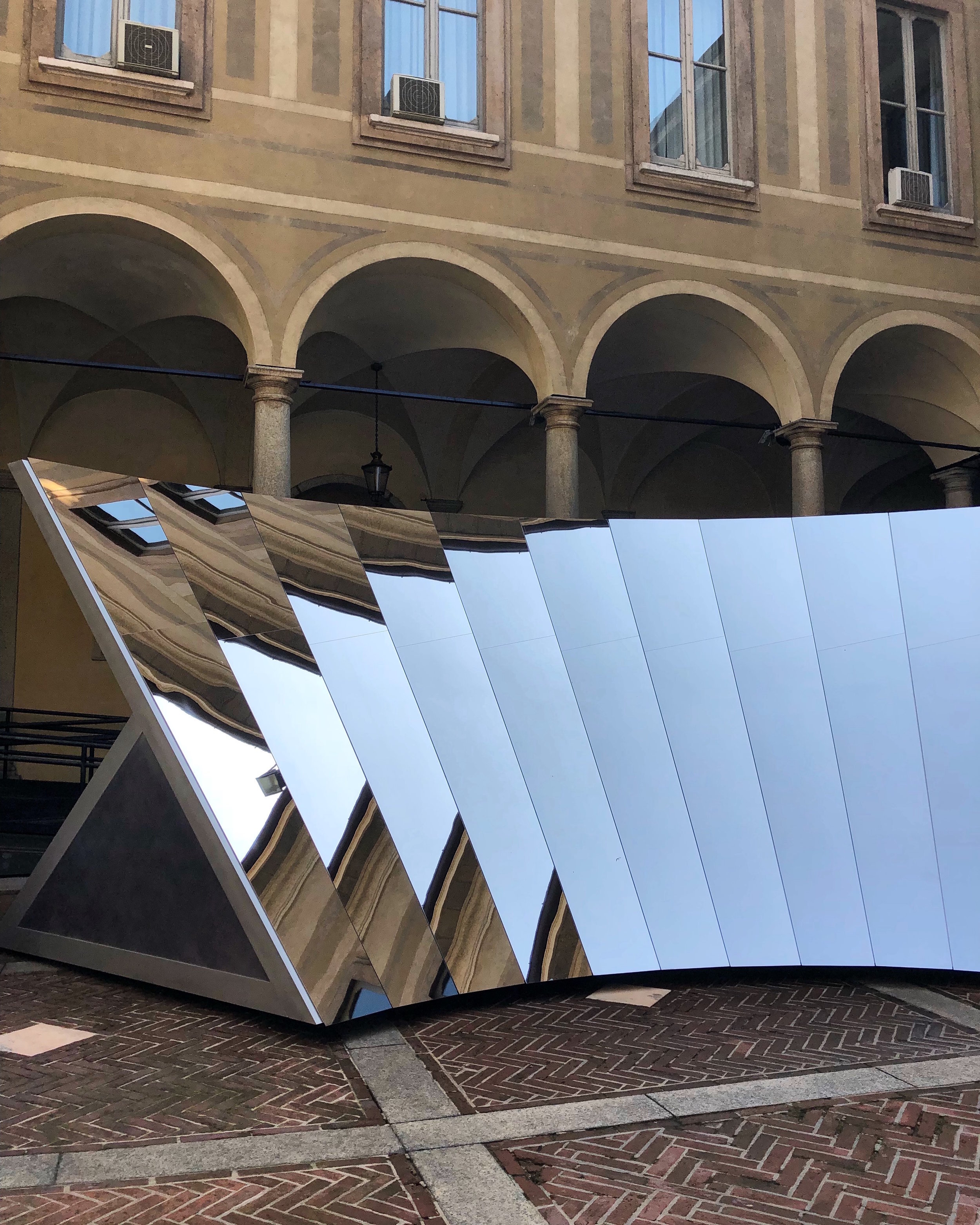
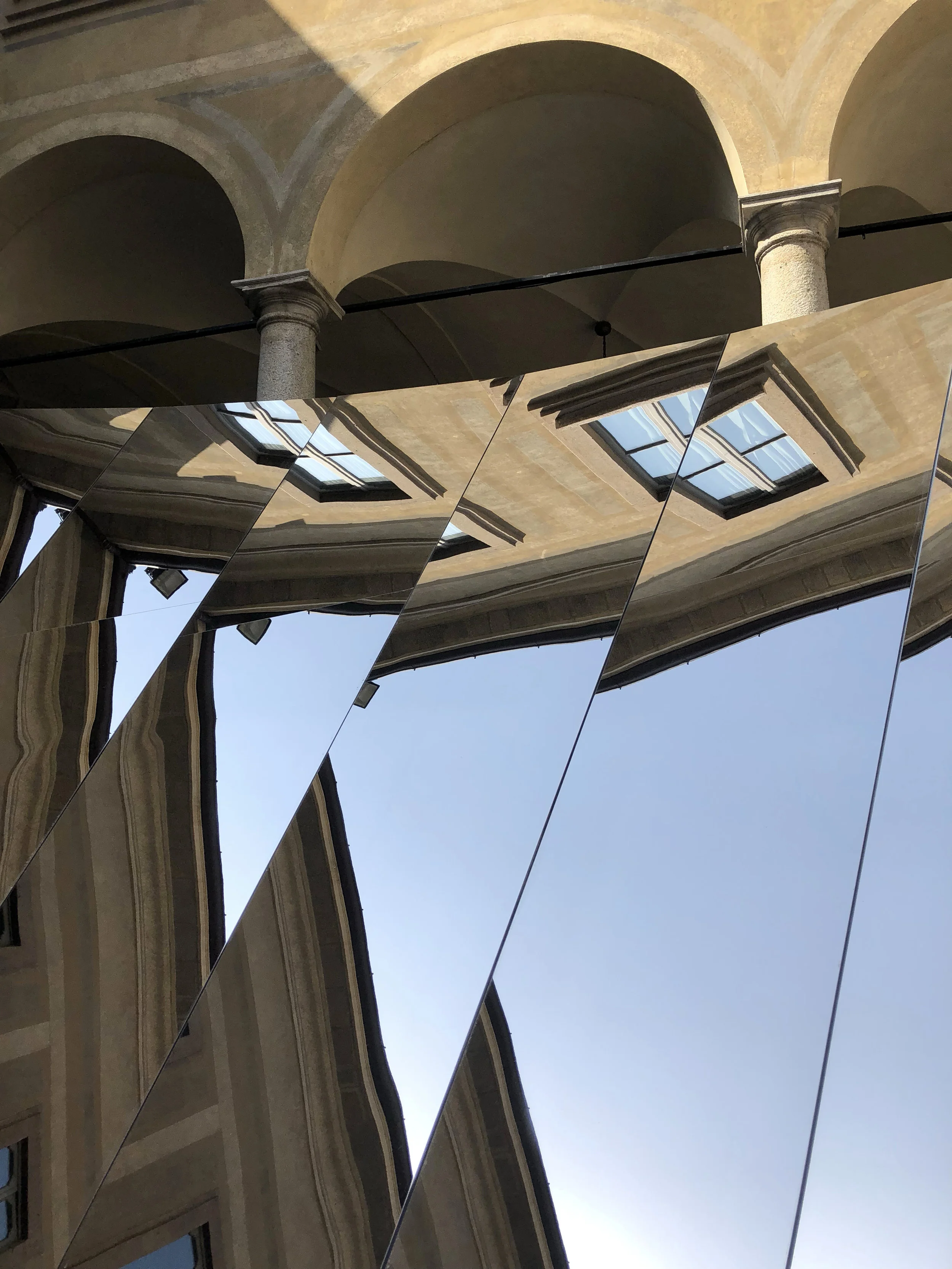
The sensory reactions of light, space and colour formed the basis of this years Cos collaboration with artist Phillip K Smith III. The immersive installation mirrored the structures Italian-renaissance surroundings at the Palazzo Isimbardi but also a 360 degree view of the sky; a meditative tribute to the world around us viewed with an ever changing perspective.
As a brand Cos consistently focus on the sensorial elements of tactility, modernity and functionality and these core values were clearly presented within Open Sky, curating a considered and unique experience.
4.
Minimalist lighting
The word ‘minimalism’ denotes a visual mood board of clean lines, monochromatic palettes and brutalist architecture however the true meaning is not an aesthetic…
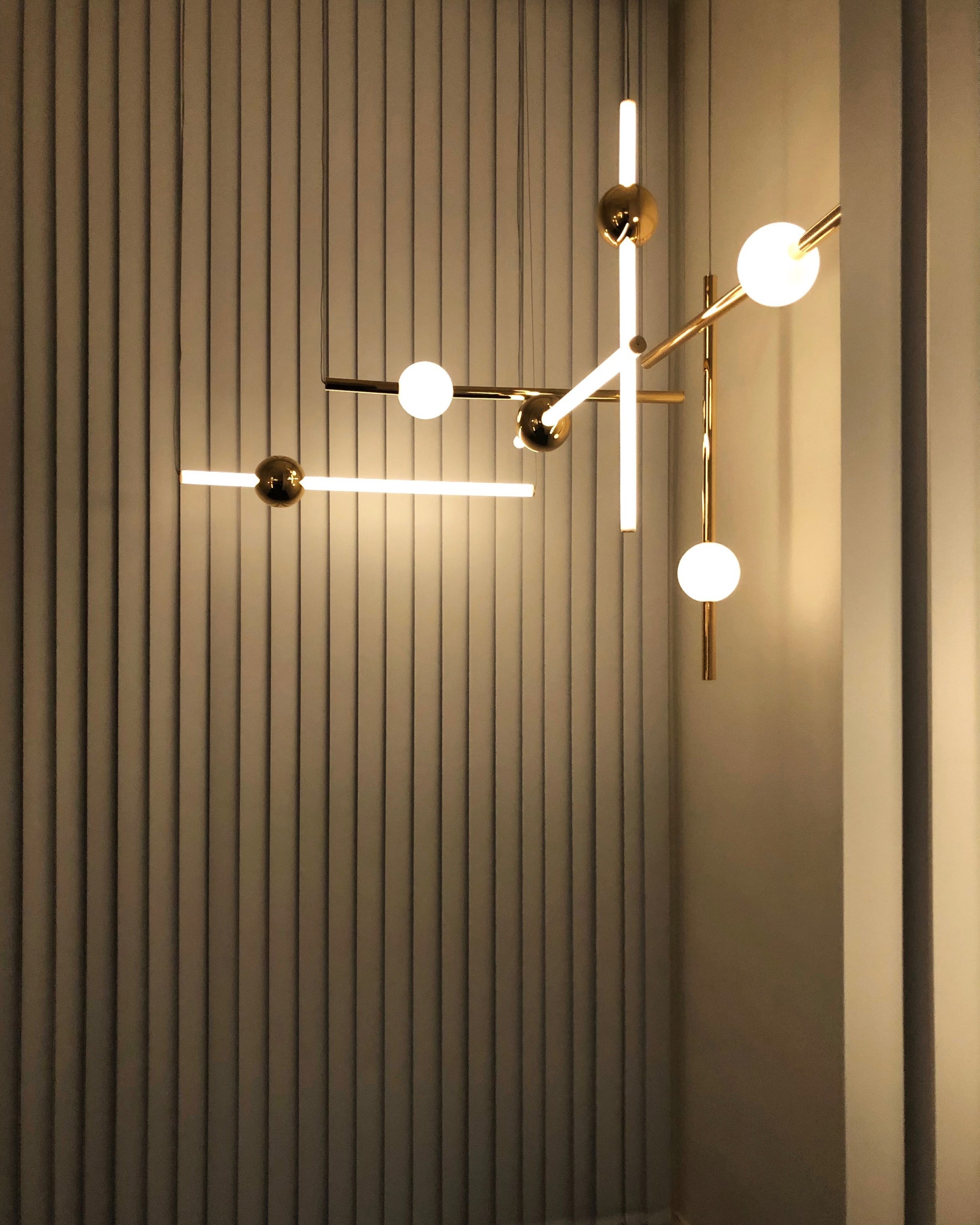
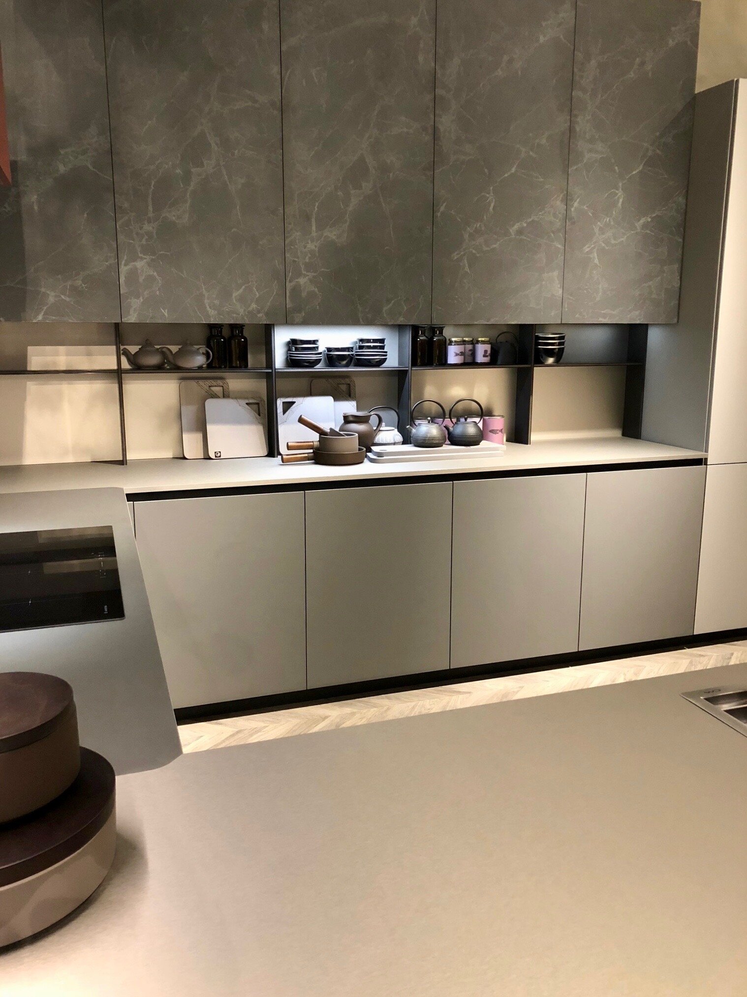
Do our possessions offer purpose? That’s the question on every minimalists lips, a key sentiment apparent throughout a variety of the brands presentations this year with lighting in particular utilised as a tool rather than as a statement. Hidden LED lights behind mirrors or within cabinetry were cleverly combined with directional lighting, designed with function at its very core. Where pendant-lighting statements were made the forms were large but notably simple, even within British designer Lee Broom's latest product launch - titled 'Observatory'. Presented within an equally pared-back installation, each design played with sculptural and spherical forms, with mirror-polished finishes in modular systems, allowing the lighting sculptures to be built according to a spaces needs.
5.
Vitra - Typecasting
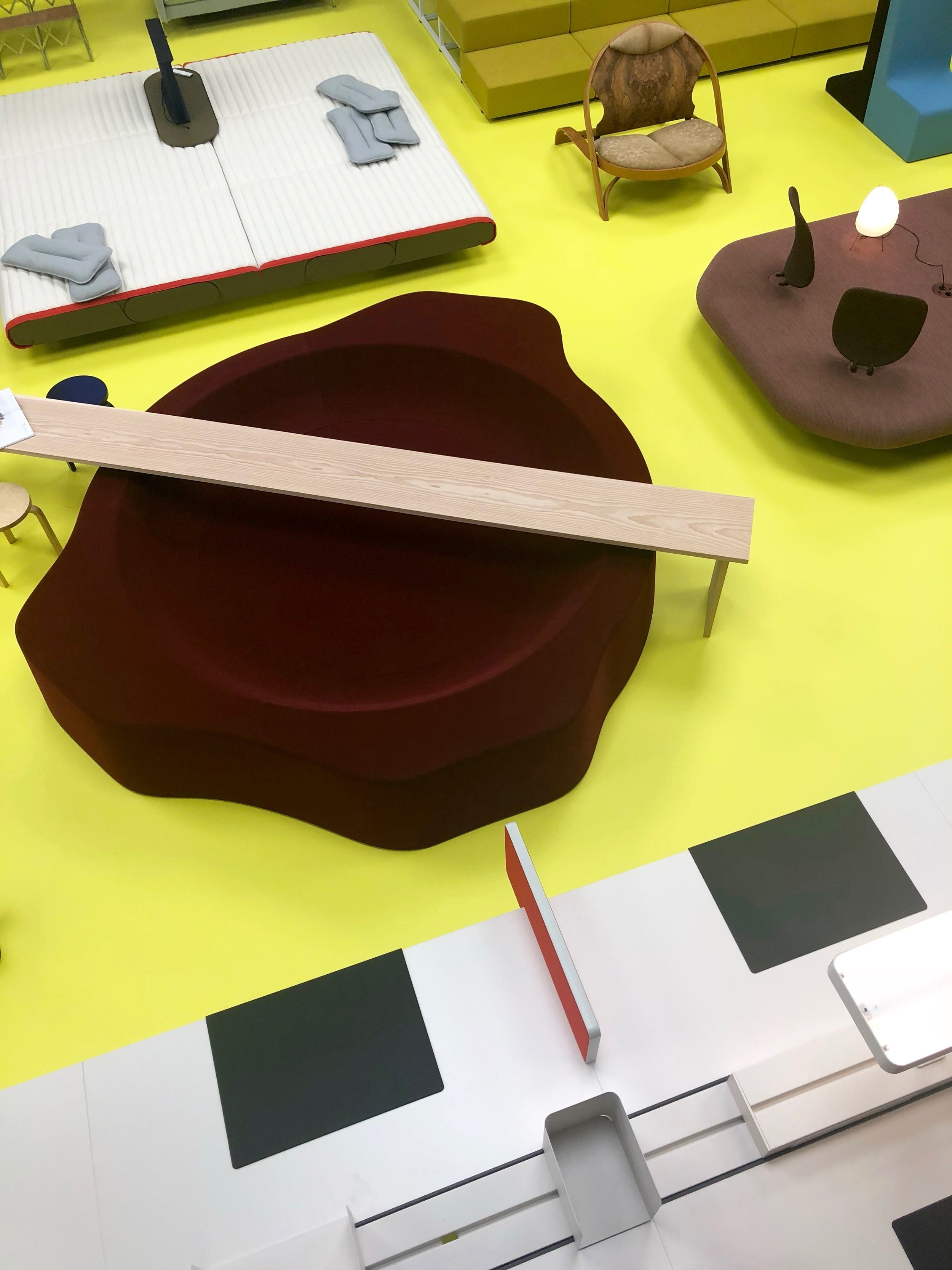
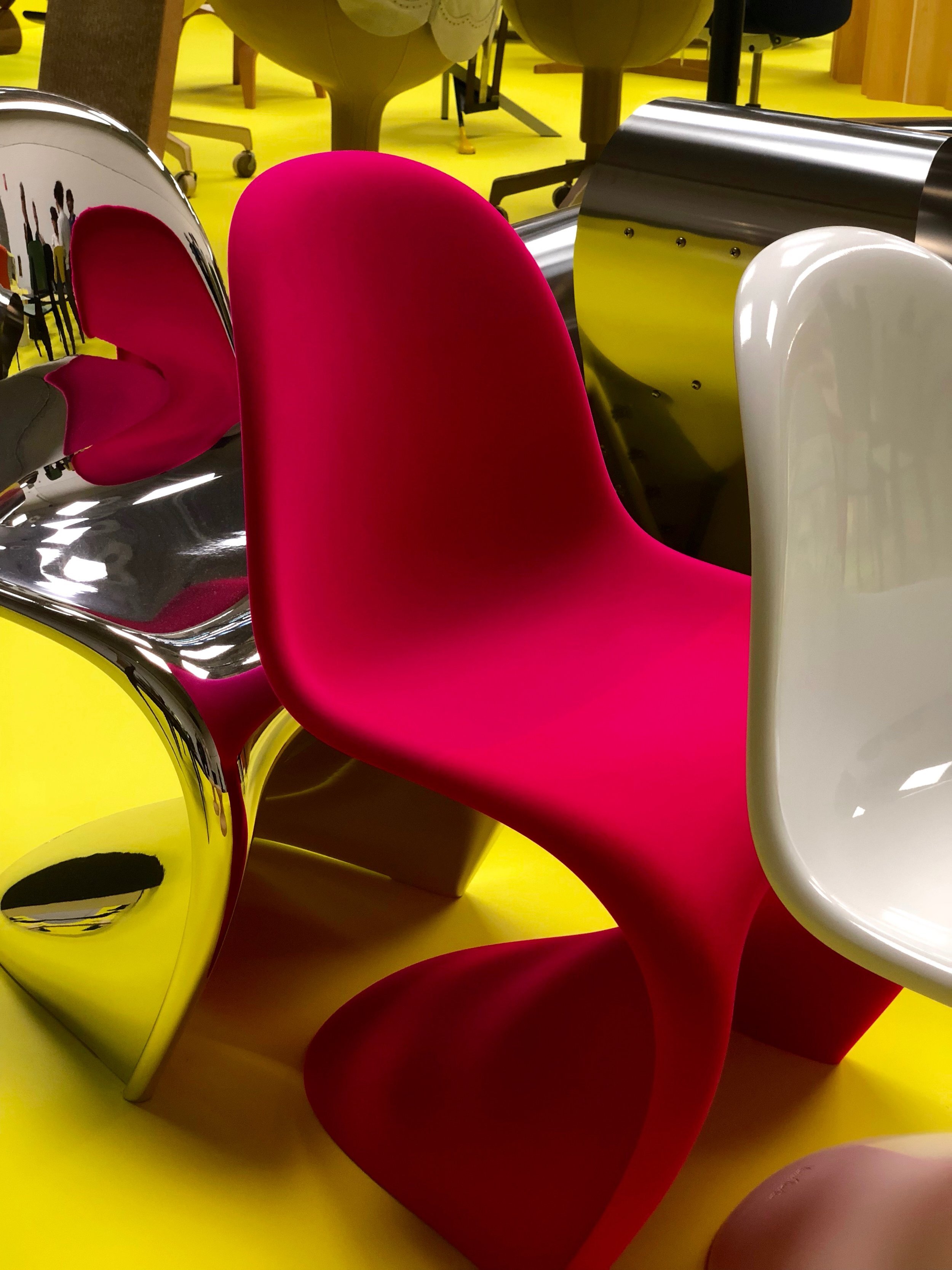
The iconic Vitra, a brand well known for its collaborative design ethos with design greats such as Charles & Ray Eames, George Nelson, Jean Prouve and Ronan & Erwan Bouroullec hosted Typecasting; an assembly of iconic, forgotten and new Vitra classics.
The opening party, held the evening prior to Milan’s Salone Del Mobile official opening, provided an exclusive and expansive view of Vitra's past, present and future. The curator of the exhibition, designer Robert Stadler, emphasised the social role furniture plays in our daily lives, of chairs in particular, exploring why identifying oneself with particular objects is essential for cultivating and projecting an individual self-image. The collection was split into various ‘profiles’, defined by the product’s characteristics and function. The 'Communals' profile was particularly interesting, a collections of objects designed to invite people to gather, share and communicate.
6.
Textual togetherness
Change is underway in global premium-living. In a constantly evolving world our homes social capabilities have become increasingly significant. The current mood of ‘Togetherness’ was consciously considered within the textured elements showcased this year, from modular sofas to silky high-pile rugs; comfort and customisation were consistently key.
Possibly the most refreshing considerations however were made within upholstery. Dining and lounge chairs were presented without the formalities normally associated to them, embracing suedes, finishes loose and gathered, for a more inviting and comforting experience.
The German brand, Rolf Benz, like us believe that a home is not a place, it’s a feeling - which is possibly why they’re contemporary, biomorphic concepts felt so inspiring to us.


